Most people think neutral decor is boring. They see a sea of beige and feel nothing. I used to think the same until I ruined my first apartment with “Cool Gray” paint. It felt like living inside a rainy cloud. That mistake taught me that peaceful homes require more than just lack of color. They require depth.
You will learn how to use warm whites, earthy ochres, and “Greige” to build a sanctuary. We cover 21 specific strategies to fix “beige fatigue.” This guide includes exact paint codes from Sherwin Williams and Benjamin Moore. We look at budget-friendly brands like IKEA and high-end options like Restoration Hardware. You will see how to layer textures to avoid a flat look. We also address why the “All White” trend is failing in 2025.
By the end, you will have a roadmap for a home that feels like a deep breath.
Why Your Neutral Room Feels Cold
I spent $400 on “Stonington Gray” paint in 2019. I thought it would look sophisticated. Instead, my living room looked like a hospital waiting room. My friend Sarah, an architect, walked in and said “You forgot the soul.”
She was right. Neutrals fail when they lack undertones. If you pick a gray with blue undertones in a north-facing room, it turns purple. If you pick a white that is too yellow, it looks aged. This guide solves those common failures. We focus on “Organic Modern” and “Warm Minimalism” styles that dominate the 2025 design market.
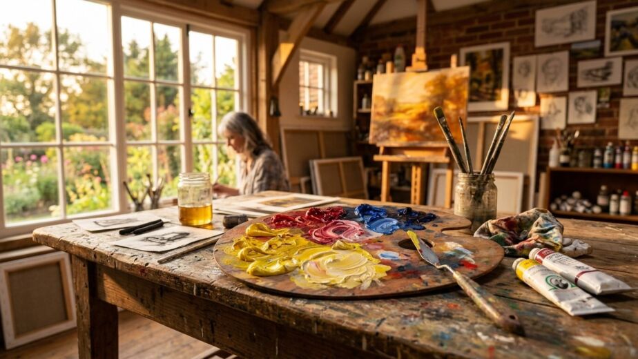
Add Image Here
1. Embrace the Power of Greige
Greige is the bridge between cold gray and muddy beige. It is the most versatile tool in your kit. I recommend Sherwin Williams Agreeable Gray for most open-plan homes. It shifts with the light. In the morning, it feels crisp. At night, under warm LEDs, it feels cozy.
I used this in a client’s 1920s bungalow last year. The original walls were a harsh optic white. By switching to a greige, the crown molding finally popped. It created a sense of history without feeling dusty. If you want a peaceful home, start with a wall color that doesn’t fight your furniture.
2. Layer Tonal Whites
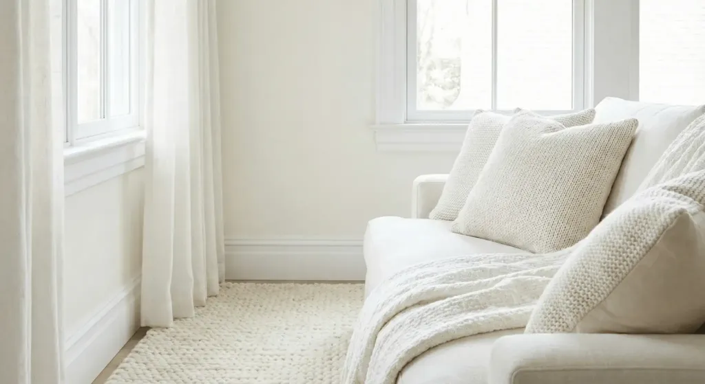
White is not just white. A peaceful room uses three or four shades of white. Use a bright, crisp white for the trim. Use a soft, creamy white for the walls. Use a textured, linen white for the curtains. This creates “visual vibration.”
When everything is one shade, your eyes get bored. I saw this in a high-end condo in Miami. The owner spent $20,000 on white furniture, but it looked cheap. We added cream wool rugs and bone-colored pillows. Suddenly, the room felt expensive. Look at Benjamin Moore White Dove for a reliable wall choice.
3. Introduce Raw Wood Elements
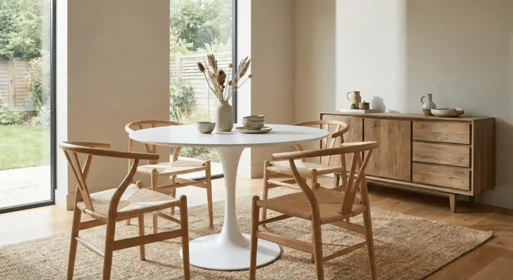
Neutrals need organic materials to breathe. Wood brings warmth that paint cannot mimic. I prefer light oak or reclaimed elm. Avoid red-toned cherries or dark mahogany if you want a modern neutral look.
In my own dining room, I paired a white pedestal table with oak wishbone chairs. The contrast is subtle. It keeps the room from looking like a furniture showroom. Wood provides a “grounding” effect. It reminds us of nature, which is the root of peace.
4. Use Black as a Focal Point
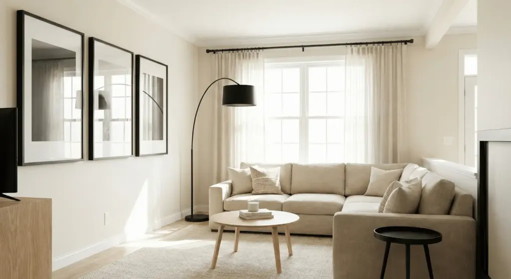
A neutral room without black is a mistake. Black acts like mascara for a room. It defines the edges. Use black metal picture frames or a matte black floor lamp.
I once worked on a “Scandi-Boho” living room that felt “mushy.” Everything was tan and cream. We swapped the brass curtain rods for black steel ones. The change was instant. The room felt structured. Do not be afraid of a few dark hits. They make the light colors look cleaner.
5. Master the Art of Textural Layering
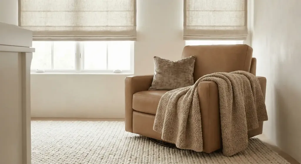
Texture is the secret language of neutral design. Since you aren’t using bold colors, you must use touch. Combine boucle, velvet, linen, and leather.
I recently helped a friend style her nursery. She wanted it all beige. We used a chunky knit wool rug, a smooth leather glider, and linen blackout shades. Even though the color palette was tiny, the room felt rich. Brands like Arhaus excel at this. Their textured fabrics are worth the investment for high-traffic pieces.
6. Choose Earthy Ochre Accents
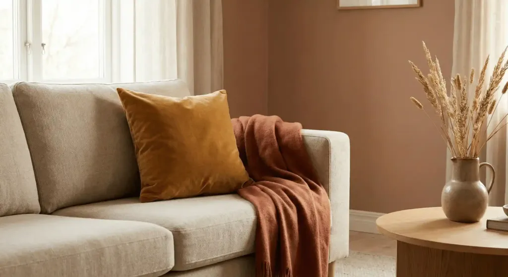
If “pure” neutral feels too sterile, look to the earth. Ochre, terracotta, and muted clay are “new neutrals.” They add heat without breaking the peaceful vibe.
Think about the desert. It is neutral but full of life. I suggest adding one ochre velvet pillow to a linen sofa. It draws the eye without shouting. I used this trick in a windowless home office. The warm tones compensated for the lack of natural light.
7. Invest in Stone and Marble
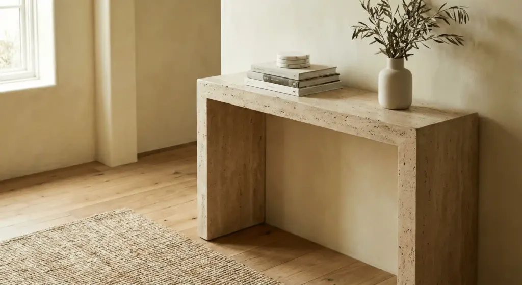
Natural stone provides a pattern that feels timeless. Use travertine coffee tables or marble coasters. Travertine is making a massive comeback in 2025 because of its porous, matte look.
I found a vintage travertine table at a thrift store for $50. It transformed my entryway. It feels solid and permanent. In a world of fast furniture from Wayfair, real stone adds “heft” to your design. It signals quality and calm.
8. Opt for Limewash Wall Finishes
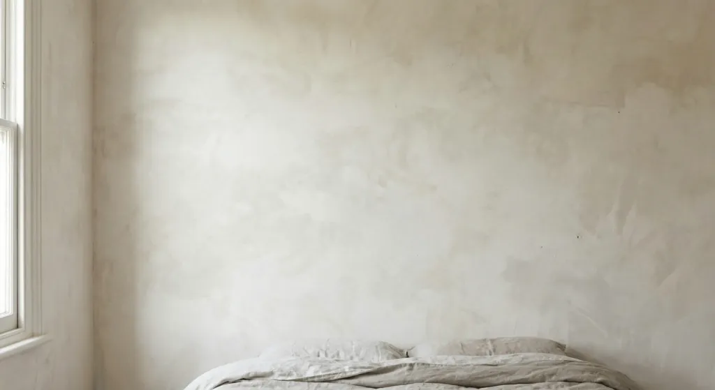
Flat paint can feel plastic. Limewash is an ancient technique using crushed limestone. It creates a soft, cloudy effect on walls. Brands like Bauwerk Colour or Roman Clay by Portola Paints are leaders here.
I applied limewash in my bedroom last summer. The application is messy, but the result is like sleeping inside a silk cocoon. It catches the light in a way that standard latex paint never will. It hides imperfections in old walls too.
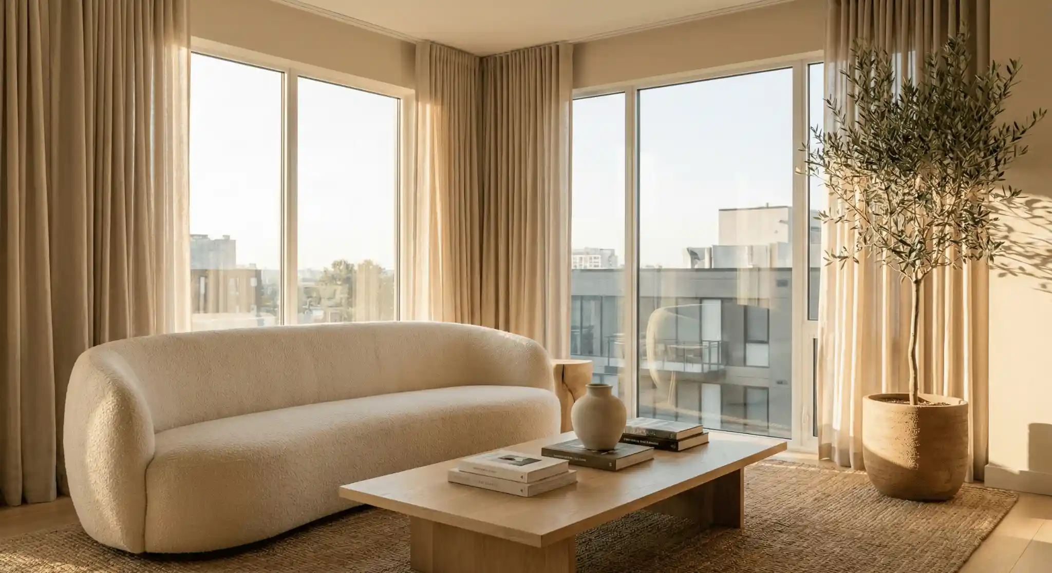
9. Bring the Outdoors In with Biophilic Design
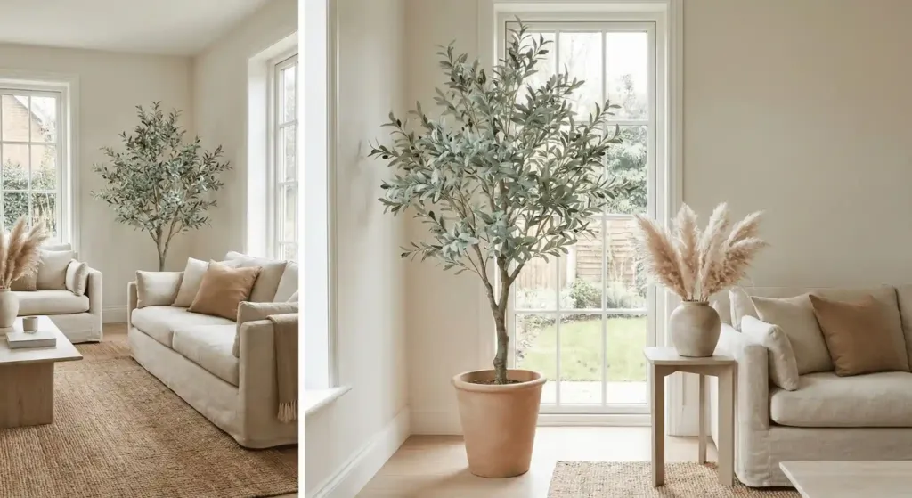
Peaceful homes need life. A large olive tree or a cluster of dried pampas grass fits the neutral theme perfectly. Green is technically a color, but in a neutral room, it acts as a “living neutral.”
I prefer a “Faux Olive Tree” from Pottery Barn if you lack a green thumb. It adds height and a soft, sage-green hue. This breaks the monotony of tan and white. It connects the indoors to the outside world.
10. Focus on Low-Profile Furniture
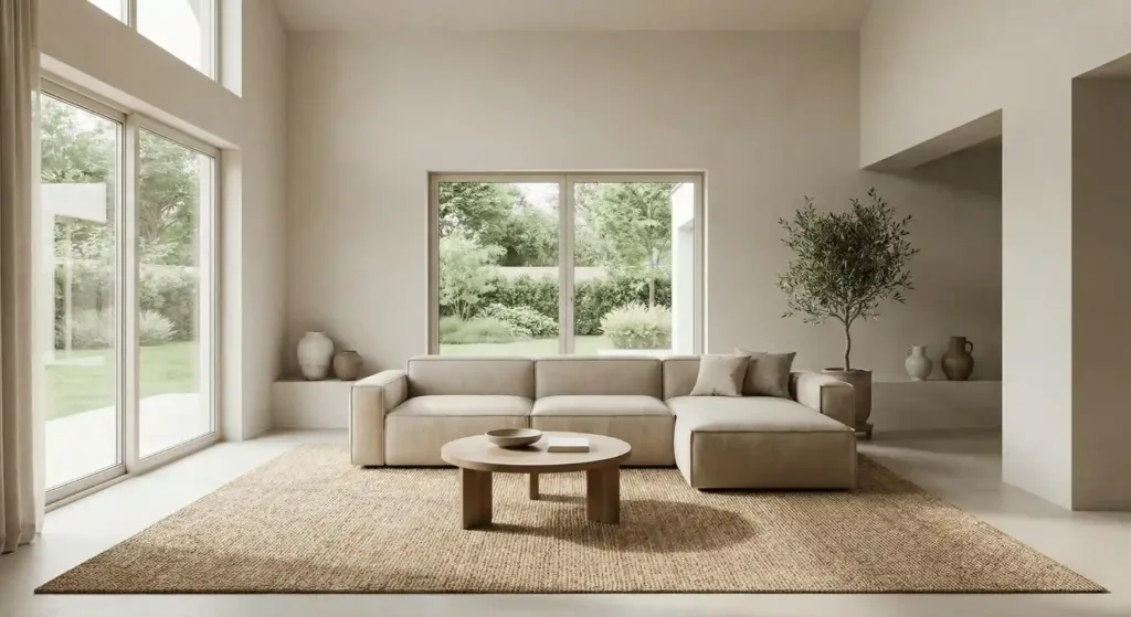
Clutter is the enemy of peace. Neutral rooms thrive on “negative space.” Choose furniture that sits low to the ground. This makes ceilings feel higher and rooms feel airier.
I learned this after buying a massive, high-back sectional. It ate the room. I replaced it with a low-slung, modular sofa from CB2. The energy changed immediately. You could see more of the floor and walls. The room breathed again.
11. Use Subtle Patterns Like Herringbone
You don’t need floral prints to have a pattern. Look for “self-patterns” in your materials. A herringbone wood floor or a waffle-knit throw blanket adds interest.
In a kitchen renovation I managed, we used white subway tile. But we laid it in a vertical stack. This small shift made a standard neutral material look custom. It added a “rhythm” to the walls.
12. Switch to Warm LED Lighting
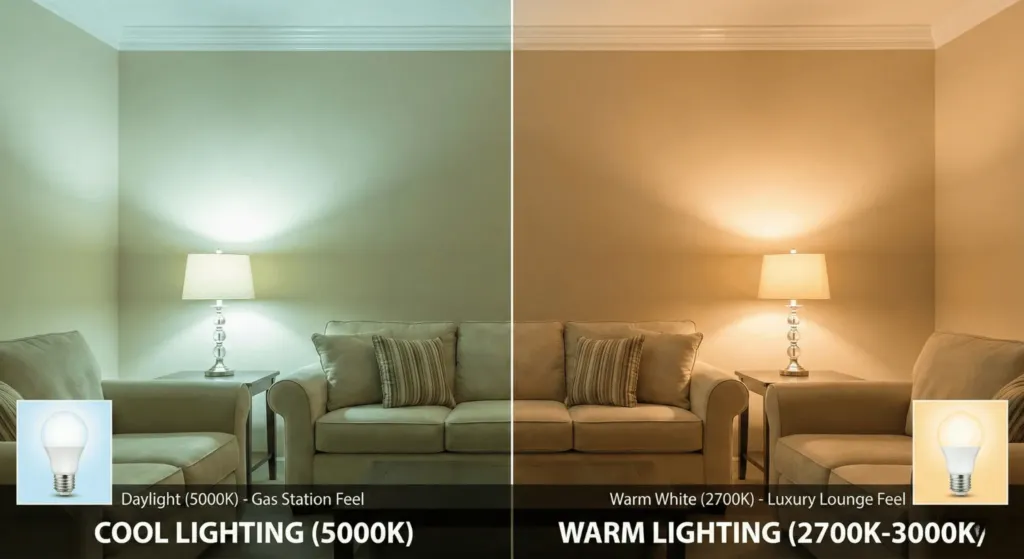
Cool-toned light bulbs will kill a neutral room. They turn beige into “zombie skin” green. Always choose bulbs in the 2700K to 3000K range.
I visited a hotel that used 5000K “Daylight” bulbs in a neutral lobby. It felt like a gas station. We changed the bulbs to “Warm White,” and the space instantly felt like a luxury lounge. Lighting is 50% of your color palette.
13. Incorporate Woven Grass and Rattan
Rattan isn’t just for beach houses. In a modern neutral home, a rattan basket or a seagrass rug adds an “artisanal” touch. It feels handmade.
I use seagrass rugs from Safavieh as a base layer. They are durable and affordable. They provide a golden-tan base that makes white furniture look bright. It also handles pet hair better than high-pile carpets.
14. Mix Metal Finishes
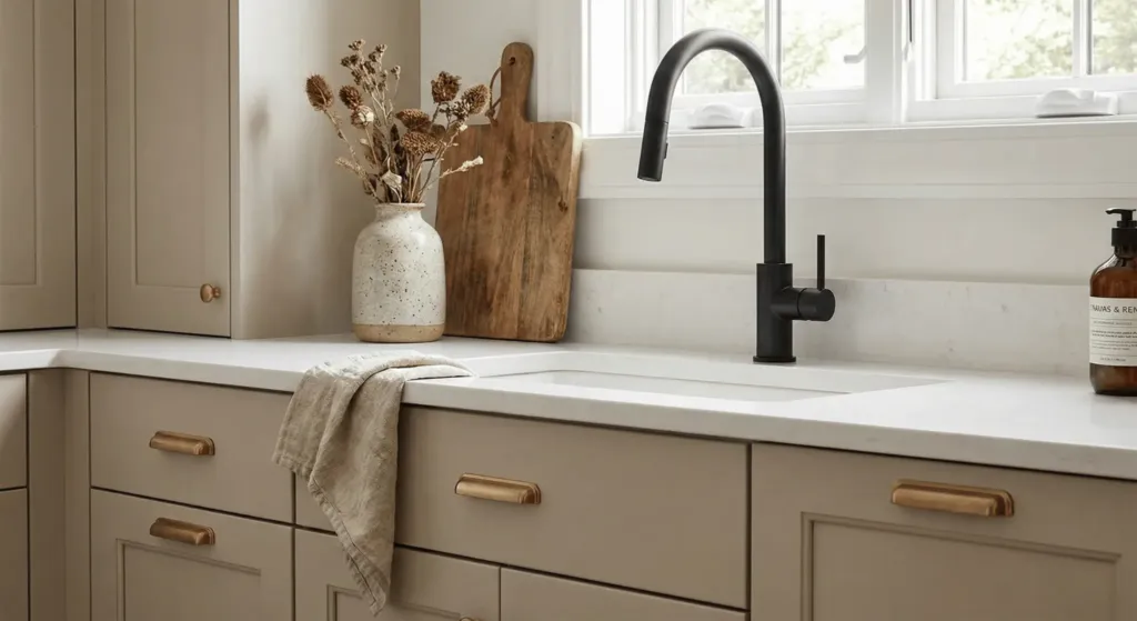
Don’t stick to just one metal. A mix of brushed bronze and matte black keeps a neutral room from looking “builder grade.” Avoid high-shine chrome, which can feel cold.
In my kitchen, I have brass cabinet hardware and a black faucet. The brass adds warmth, while the black adds “edge.” This prevents the room from feeling like a “set.” It feels like a home collected over time.
15. Prioritize Window Treatments
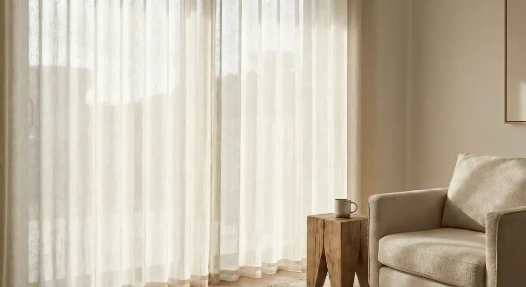
Empty windows feel cold and unfinished. For a peaceful home, use floor-to-ceiling linen shears. They soften the light coming into the room.
I once skipped curtains in a minimalist living room. It echoed. It felt “sharp.” After adding off-white linen drapes from The Shade Store, the acoustics improved and the room felt “hugged.”
16. Create a “Curated” Bookshelf
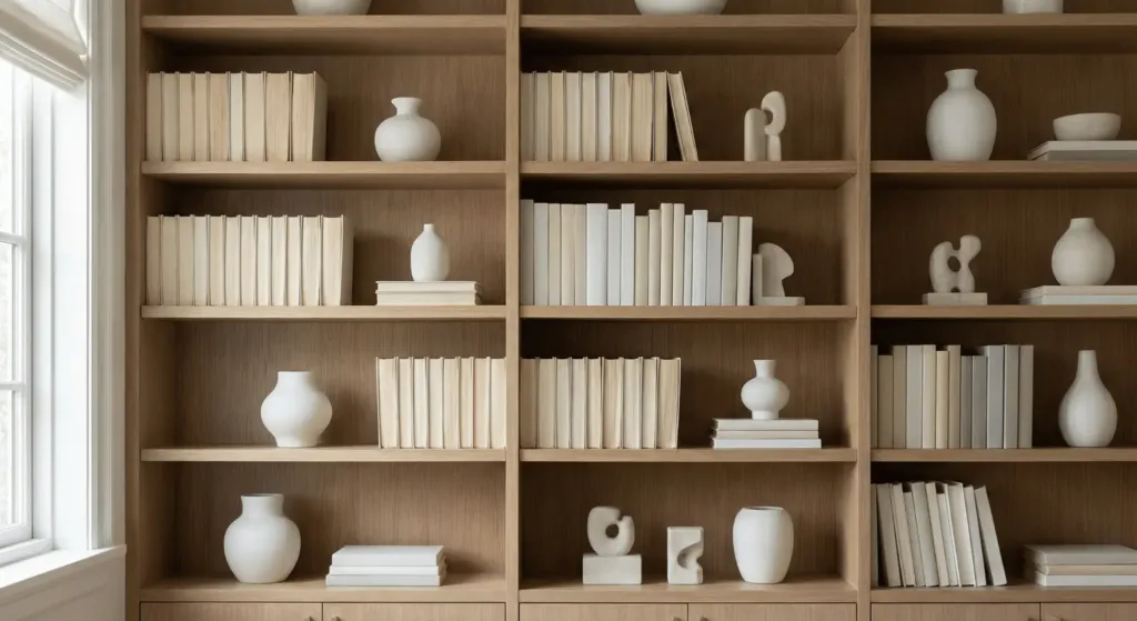
Books can be colorful and messy. To keep a neutral vibe, turn some book spines inward. Or, group books by color. Mix in ceramic vases and small sculptures.
I struggled with my massive book collection for years. It looked like a rainbow exploded in my neutral office. By mixing in white ceramic pieces from Etsy artists, I broke up the visual noise. It became a focal point rather than a distraction.
17. Use Large Scale Art
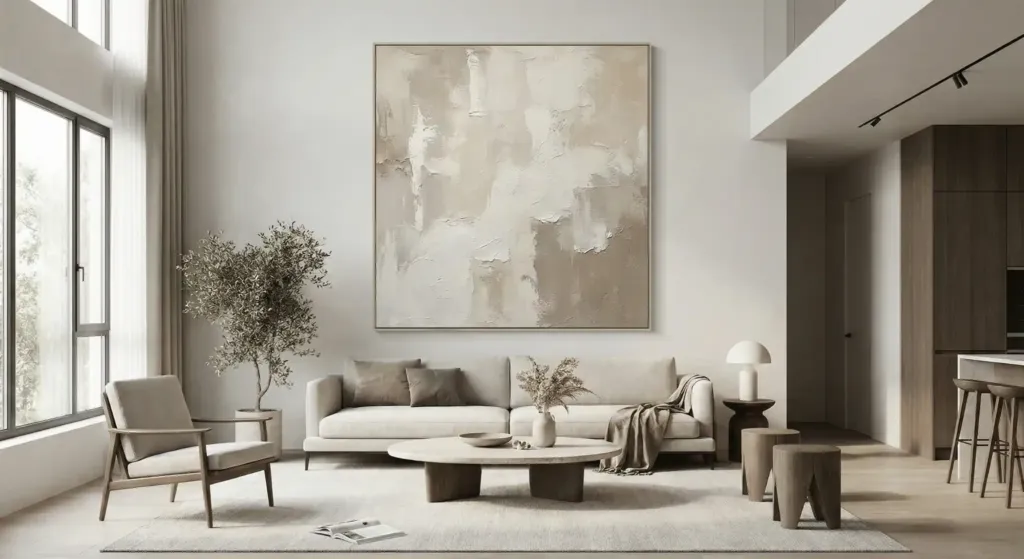
One big piece of art is better than a gallery wall of ten small items. Small items create “visual clutter.” Large-scale abstract art in neutral tones creates a “destination” for the eyes.
I found a 48×48 canvas and painted it with “plaster” and beige paint. It cost me $60. It looks like a gallery piece. It anchors my living room and makes the 9-foot ceilings look like 12-foot ones.
18. Experiment with Suede and Nubuck
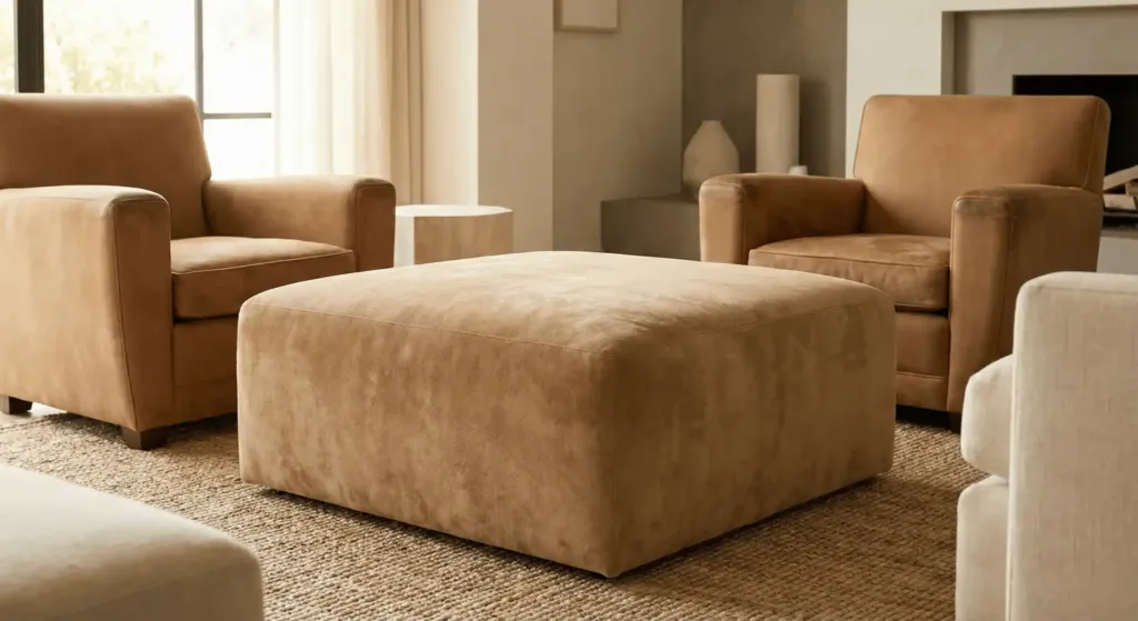
Leather is great, but suede is softer. A tan suede ottoman adds a “muffled” texture that absorbs sound and light. It feels incredibly high-end.
I bought a pair of nubuck chairs from West Elm three years ago. They have aged beautifully. The “patina” they develop over time adds a layer of “story” to a neutral room.
19. Define Zones with Rugs
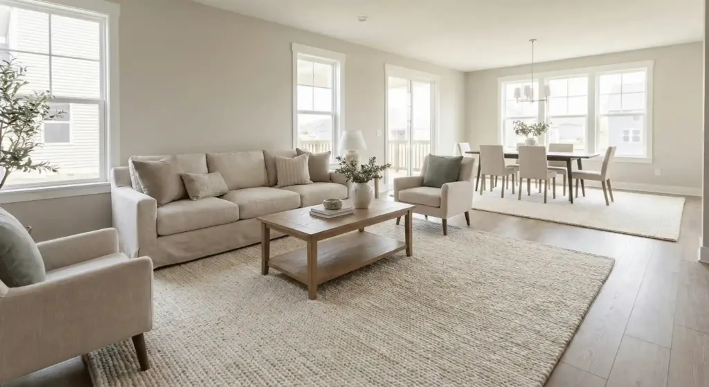
In an open-concept neutral home, the furniture can “float” aimlessly. Use large area rugs to “anchor” each space. Ensure the rug is big enough for all furniture legs to sit on it.
A common mistake is buying a rug that is too small. It makes the room look disjointed. For a peaceful home, go big. I recommend wool-blend rugs for their soft feel and stain resistance.
20. Add Architectural Interest with Fluted Details
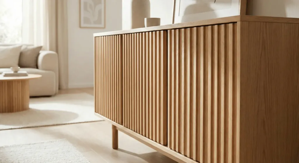
Fluted wood panels or “tambour” details add vertical lines. This draws the eye up. You can find fluted sideboards or even apply DIY fluting to a kitchen island.
I added oak fluting to a plain IKEA sideboard. It took one weekend. Now, it looks like a custom piece from a boutique. These lines add “shadow play” to a neutral room, which creates depth without color.
21. Curate Your Scents
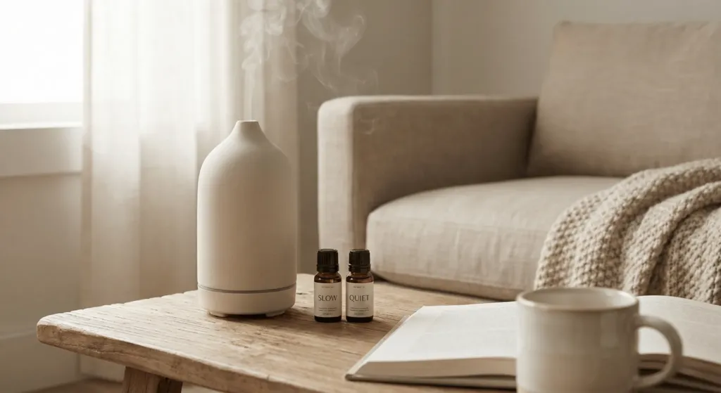
A peaceful home is not just visual. Use scents like sandalwood, cedar, or vanilla. These “warm” scents match a neutral palette.
I use a stone diffuser from Vitruvi. It looks like a sculpture on my coffee table. The scent of “Slow” or “Quiet” essential oils completes the sensory experience. It tells your brain “You are safe here.”
The “Boring Beige” Myth
People claim neutral homes are for people without personalities. I disagree. I think neutral homes are for people with loud lives. If your job is stressful and your city is noisy, your home should be a “reset” button.
My biggest failure was trying to force “Emerald Green” into my house because it was trendy. I hated it within a month. I felt like the walls were closing in. When I returned to a warm sand palette, my sleep improved. My anxiety dipped. Neutrals are a tool for mental health.
Comparison: Warm vs. Cool Neutrals
| Feature | Warm Neutrals (Recommend) | Cool Neutrals (Proceed with Caution) |
| Undertones | Yellow, Red, Orange | Blue, Green, Purple |
| Vibe | Cozy, Welcoming, Sun-drenched | Modern, Industrial, Crisp |
| Best For | Living Rooms, Bedrooms | Bathrooms, High-tech Offices |
| Paint Example | SW Alabaster | BM Stonington Gray |
| Material Pair | Oak, Brass, Linen | Marble, Chrome, Velvet |
Implementation Timeline
- Day 1: Pick your “Anchor” wall color. Test samples on all four walls.
- Week 1: Paint and update lighting to 2700K.
- Month 1: Swap out “noisy” accessories for textured neutrals.
- Month 3: Invest in one “hero” piece like a stone table or large art.
FAQ: Common Neutral Design Hurdles
How do I keep a neutral house clean with kids or pets?
I have two dogs and a toddler. The secret is “performance fabrics.” Brands like Crypton or Sunbrella make white fabrics that are bleach-cleanable. Also, choose “Greige” instead of “Pure White” for high-traffic areas. It hides dust much better.
Does a neutral home have to be minimalist?
No. You can be a “Neutral Maximalist.” This means having lots of items—books, plants, sculptures—but keeping them within the same color family. It feels “collected” rather than “cluttered.”
What is the best “Neutral” paint for a dark room?
Never use gray in a dark room. It turns into mud. Use a warm white with a high “Light Reflectance Value” (LRV). Benjamin Moore Simply White is my go-to for dark basements. It reflects what little light exists.
How do I add “Life” without bright colors?
Variation in height and shape. Use tall floor lamps next to low chairs. Use round coffee tables with rectangular rugs. These “shape contrasts” provide the energy that color usually provides.
Is gray officially out of style?
“Millennial Gray” (cool, blue-toned gray) is trending down. Warm grays and “Mushroom” tones are trending up. If your gray looks like a sidewalk, it is probably outdated. If it looks like a mushroom or a river stone, it is timeless.
What is the cheapest way to “Neutralize” a room?
Remove the “clutter.” Most rooms have too many small, colorful objects. Clear the surfaces. Add one bowl of lemons or a single green branch. Painting your trim the same color as your walls (Monochromatic) is also a cheap way to look high-end..
Final Thoughts
Peaceful homes are not built by following every trend on Pinterest. They are built by understanding how light and texture interact with your mood. Start small. Change your light bulbs tonight. Buy one linen pillow tomorrow.
A neutral home is a canvas for your life. It allows your memories and your people to be the “color” in the room.