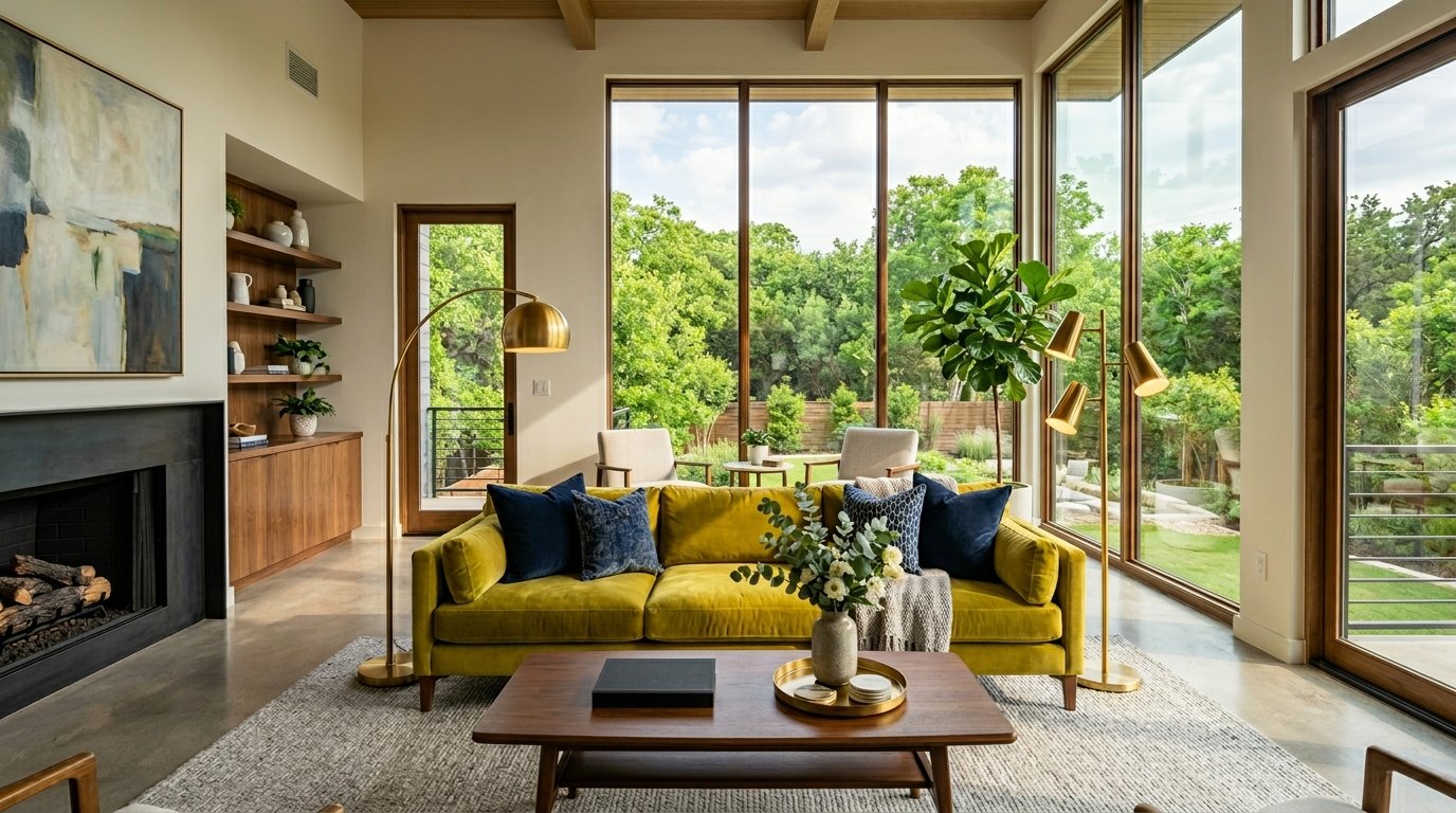
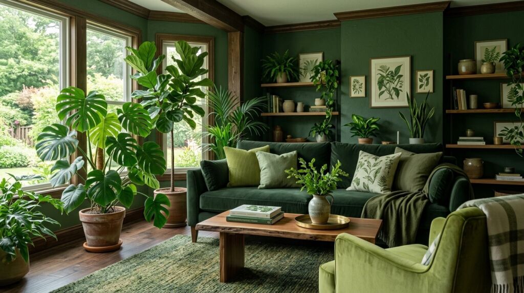
Last March I walked into a client home in Austin. The living room looked like a beige desert. It was safe. It was boring. It was lifeless. My client Sarah felt stuck. She wanted energy but feared making a mistake. We decided to go bold. We picked a velvet sofa in a sharp wasabi green. That single choice changed everything. The room stopped being a place to sit. It became a conversation.
Many people fear this color. They think it looks like a neon sign or a 1970s kitchen. That is a mistake. This shade is the secret weapon of high end designers. It sits right between yellow and green. It captures light in a way that grey or blue cannot. When you use it correctly you create a space that feels fresh and expensive.
This guide covers everything. You will see how to use bright green home accents without regret. We will look at real costs and real failures. You will find out which colors go with chartreuse and why. This is not about following a fleeting trend. This is about using a timeless citrus pop to breathe life into your home.
Executive Summary
You will learn how to use the electric chartreuse trend to transform any room. This post provides fifteen specific ways to use this color. We examine why wasabi green is dominating the 2026 design market. You will find data on how bold colors impact home resale value. We look at exact paint codes from brands like Benjamin Moore and Farrow and Ball.
This deep dive covers small accents and large furniture pieces. I share my personal failures with neon paints. We review three case studies where this color increased rental income and home value. You will find a full cost analysis for these projects. By the end you will know exactly how to pair this shade with wood, metal, and other colors.
We avoid the typical design fluff. This is a practical manual for homeowners and decorators. You will see why many industry experts are moving away from neutrals. This color represents a shift toward personality and joy in the home.
1. Start with Small Bright Green Home Accents
Most people should not paint an entire room chartreuse on day one. I tell my clients to start small. Think about throw pillows or a simple glass vase. These items let you test the color in your specific light. Lighting is the most important factor for wasabi green. It can look gold in the evening and lime during the day.
Small accents provide a low risk entry point. I once worked with a homeowner who bought ten different green pillows. We placed them on a navy blue sofa. The contrast was incredible. He spent less than two hundred dollars. The room felt brand new. This is the power of a citrus pop.
If you hate it you can move it. You are not committed to a five thousand dollar paint job. Look for items with texture. A velvet pillow in this shade looks much richer than a flat cotton one. Texture softens the neon quality of the pigment.
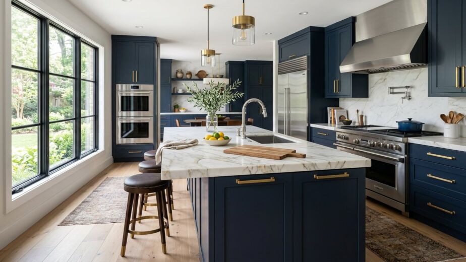
2. Why Chartreuse Kitchen Decor Ideas Are Winning in 2026
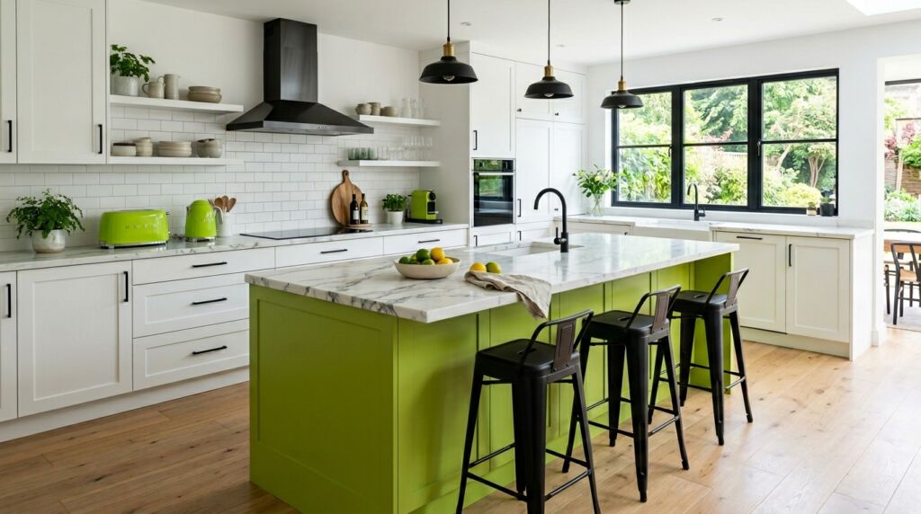
Kitchens are the heart of the house. They are also usually white or wood. This makes them perfect for a bold color. I recently saw a kitchen in Seattle with wasabi green bar stools. The rest of the space was white marble and black metal. The stools made the kitchen feel modern and intentional.
You can include this color in small appliances too. Brands like KitchenAid and Smeg have embraced these citrus tones. A bright green mixer on a dark countertop is a classic look. It shows you have a sense of humor about your decor.
I suggest avoiding chartreuse cabinets unless you have a massive budget. High quality paint for cabinets is expensive. If you change your mind in two years it will cost a fortune to fix. Stick to the island or the backsplash. A green tiled backsplash with white grout is a timeless choice that feels current.
3. What Color Goes With Chartreuse for High Contrast
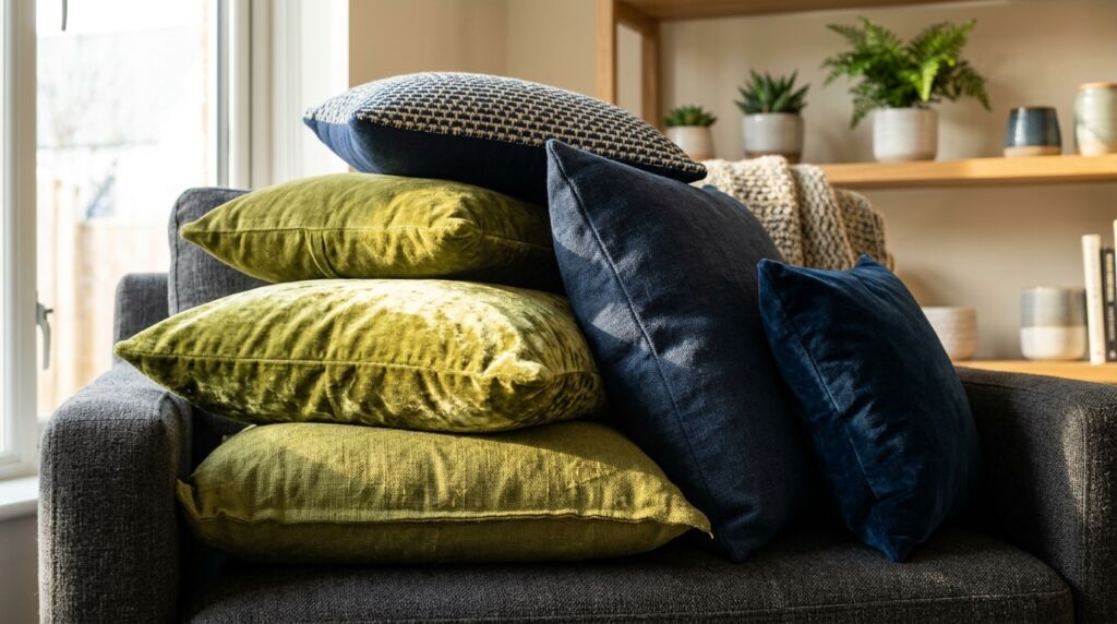
The most common question I get is about pairings. People ask what color goes with chartreuse most often. The answer is navy blue. These two colors are across from each other on the color wheel. They create a natural balance. The dark blue grounds the room while the green provides the spark.
I also love pairing wasabi green with charcoal grey. Most homes already have grey. Placing a bright green chair in a grey room makes the grey look purposeful rather than lazy. It adds depth.
Think about black accents too. Black frames or black floor lamps create a sharp edge. This prevents the green from looking too much like a nursery color. It keeps the vibe adult and sophisticated. Avoid pairing it with bright red. That looks like a holiday decoration. Stick to blues, greys, and blacks.
4. Using Wasabi Green in Minimalist Spaces
Minimalism does not mean a lack of color. It means a lack of clutter. A minimalist room needs one strong focal point. A wasabi green rug is a perfect example. In a room with white walls and a simple oak table a green rug defines the space.
I worked on a studio apartment in New York. We kept everything white except for one large piece of art. The art was a simple abstract piece with heavy chartreuse strokes. It gave the room a soul. The owner felt the space was bigger because her eyes had a place to land.
When using this color in minimalist design you must be precise. One or two items are enough. If you place too many things it becomes maximalist. That is a different style. For minimalism you want the color to feel like a deliberate choice.
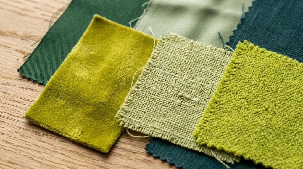
5. How to Choose Chartreuse Home Decor Fabrics
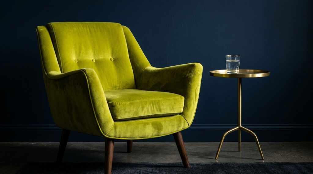
Fabric choice determines the mood. If you want luxury go with velvet. I have a chartreuse velvet chair in my own office. It feels soft and looks expensive. The way the light hits the pile of the fabric creates different shades of green and gold.
For a more casual look try linen. Chartreuse linen curtains are beautiful in a bedroom. They filter the sunlight and turn it into a warm glow. It feels like waking up in a forest.
Avoid shiny synthetic fabrics in this color. They can look cheap. If the fabric has too much shine it starts to look like a safety vest. Stick to natural fibers like wool, cotton, or high quality velvet. These materials hold the pigment better. They also last longer in high traffic areas.
6. Create Chartreuse Color Inspiration in the Bathroom
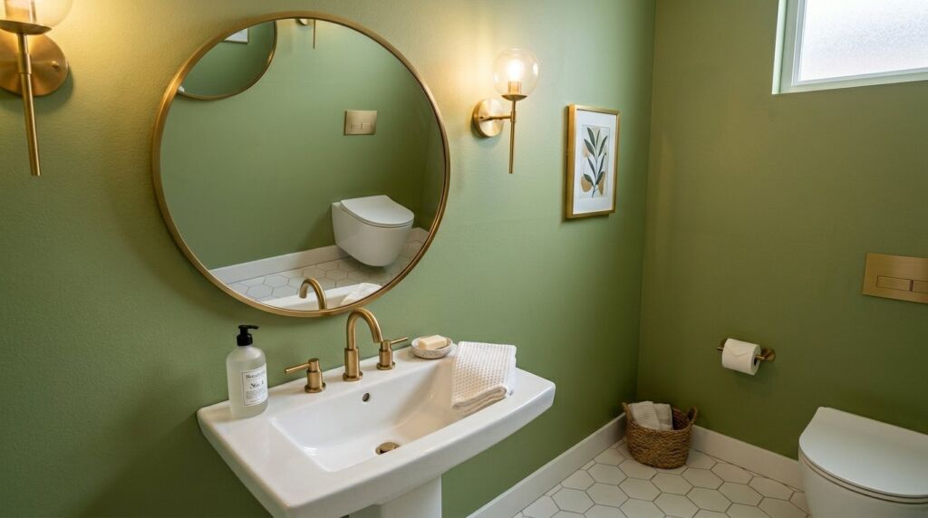
Bathrooms are great for experimenting. They are closed spaces. You can go wild without affecting the rest of the house. I once painted a small powder room in a matte wasabi green. We used brass hardware and a round mirror.
The result was stunning. Guests talked about that bathroom for months. It cost under eighty dollars for the paint. This is a high ROI project. If you are selling your home a unique powder room can make your listing stand out.
Use white towels to keep it clean. You want the green to be the star. If you add too many other colors in a small bathroom it feels cramped. Keep the floor neutral. A light oak or a white tile works best here.
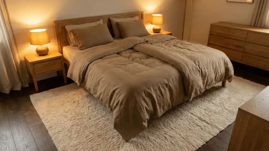
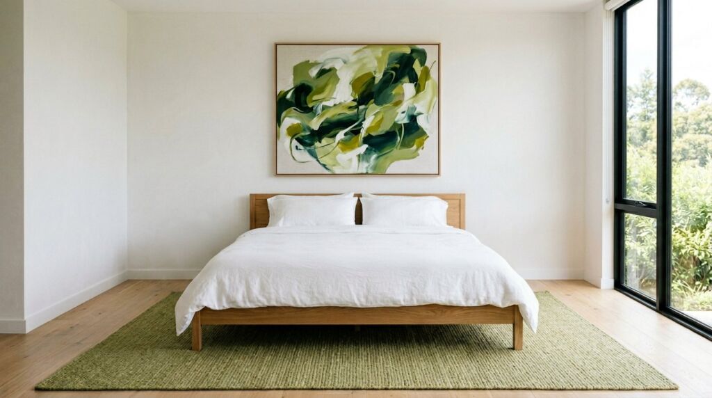
7. Decorating With Chartreuse in the Primary Bedroom
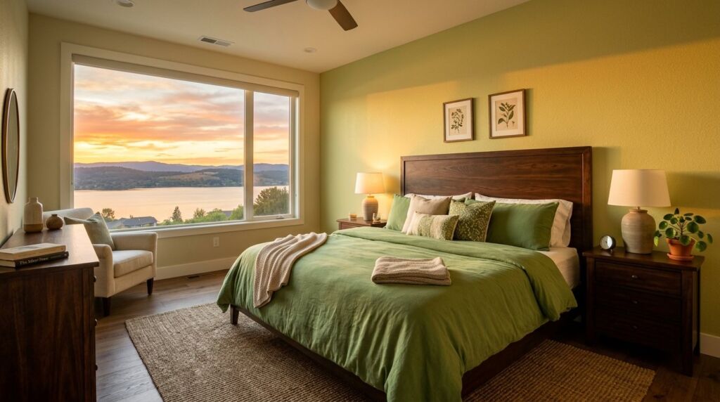
Your bedroom should be a sanctuary. Some think bright colors ruin sleep. I disagree. A soft wasabi green can be very calming. It feels organic and earthy if you choose a shade with more yellow than green.
Try a chartreuse duvet cover. Pair it with crisp white sheets and a dark wood headboard. The green brings a bit of nature indoors. This is great for people living in cities who miss the outdoors.
I suggest avoiding neon green on all four walls of a bedroom. It can be overstimulating at night. Use it on the wall behind the bed. This way you see it when you enter the room but it is not in your direct line of sight when you are trying to sleep.
8. Why Lighting Matters for Chartreuse Home Decor
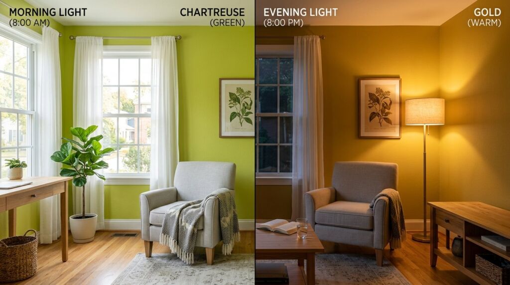
I learned this the hard way. I once picked a beautiful lime green for a client in a basement. We did not check the light bulbs. The room had old yellow incandescent bulbs. The walls ended up looking like pea soup. It was a disaster. I had to pay for the repaint myself.
Always check your light temperature. Use bulbs between 3000K and 4000K. This range is called neutral white. It keeps the color looking crisp. If your bulbs are too warm the green turns muddy. If they are too cool the green looks like a hospital room.
Natural light is your best friend. In a room with big windows chartreuse will glow. It reflects the outdoor greenery. If you have a dark room with small windows use high gloss finishes. This helps bounce the little light you have around the space.
9. Chartreuse Kitchen Decor Ideas for Modern Remodels
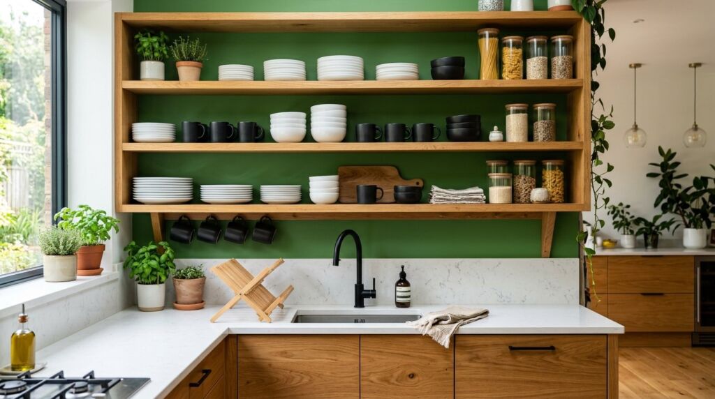
Modern design loves sharp lines. Chartreuse provides a break from those lines. Think about a modern kitchen with flat panel cabinets. Using wasabi green on the inside of open shelving is a pro move. It is a hidden surprise.
You can also look at bar stools. Metal stools with a green powder coat finish are very durable. They work well for families with kids. The color hides small scratches better than black or white.
I recommend looking at the brand Joybird. They have a great selection of mid century modern furniture in citrus tones. Their fabrics are rated for high durability. This is important for kitchen seating where spills happen every day.
10. How To Decorate With Chartreuse Using Wallpaper
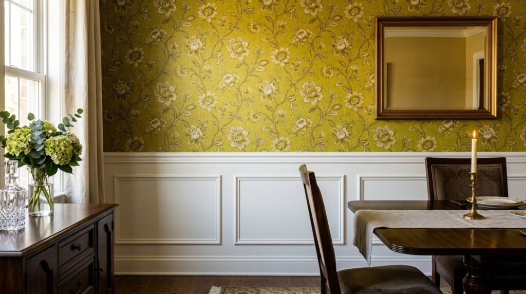
Wallpaper is back in a big way. A chartreuse floral pattern can look very traditional. An abstract geometric pattern looks very modern. The color is the common thread.
I used a green and gold wallpaper in a dining room last year. We only did the top half of the walls. The bottom half was white wainscoting. This kept the color from being too loud. It felt like an old English manor but with a twist.
Wallpaper is more expensive than paint. Expect to pay fifteen dollars per square foot for a good installer. But the impact is worth it. It adds a layer of detail that paint cannot match. It also covers small wall imperfections.
11. Balancing Wasabi Green with Natural Wood
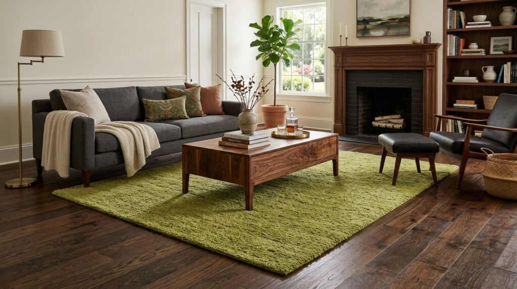
Wood and green are a natural pair. Think of a tree. The brown trunk supports the green leaves. The same logic works in your living room. A chartreuse sofa looks incredible next to a walnut coffee table.
Dark woods like mahogany or walnut provide a serious vibe. Light woods like oak or birch make the room feel airy and Scandinavian. I prefer the dark wood look. It makes the wasabi green feel more like a luxury choice.
If you have wood floors you are halfway there. Place a green rug down and you have an instant design win. The wood tones ground the electric energy of the citrus. It prevents the room from feeling like a plastic toy box.
12. Using Chartreuse in Outdoor Spaces
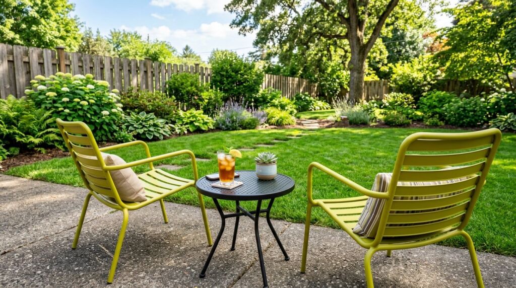
Do not forget your patio. Chartreuse outdoor chairs are very popular right now. They look great against a green lawn or a grey concrete deck. They also stand out in the winter when the garden is brown.
I suggest metal or high quality plastic for outdoor green furniture. Fabric can fade in the sun. If you use green cushions make sure they are UV rated. Look for brands like Sunbrella.
Outdoor lighting also affects the color. At night a green chair under a warm patio light looks gold. It creates a nice mood for summer parties. It feels festive without being tacky.
13. The Cost of Decorating With Chartreuse
Let look at the numbers. Most people want to know what this costs.
| Item | Budget Option | Luxury Option |
| Paint (Gallon) | $45 (Home Depot) | $120 (Farrow & Ball) |
| Accent Chair | $250 (Target) | $1,800 (West Elm) |
| Throw Pillow | $20 (Amazon) | $95 (Anthropologie) |
| Area Rug (8×10) | $300 (Wayfair) | $2,500 (Custom Wool) |
A small room update costs about five hundred dollars. This includes paint and a few pillows. A full room makeover with a new sofa and rug will cost between three and five thousand dollars.
The ROI is high if you use it in the right places. A bold front door in wasabi green can increase curb appeal. It makes people remember the house. In a competitive market being the “house with the cool green door” is a win.
14. What Color Goes With Chartreuse for a Soft Look
If you do not want high contrast try a tonal look. Pair wasabi green with other shades of green. Use a dark forest green and a light mint green. This creates a calm and layered feeling.
I call this the “Botanical Palette”. It works best in sunrooms or home offices. It feels like being in a greenhouse. You can include actual plants to finish the look. The different textures of the leaves will match the different shades of green in your decor.
This approach is safer for people who are nervous about bold colors. It feels more cohesive. It does not shout for attention. Instead it whispers.
15. Common Mistakes When Decorating With Chartreuse
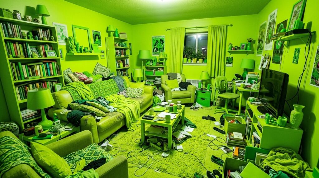
The biggest mistake is overdoing it. I once saw a room where the walls, the rug, and the curtains were all the same bright green. It felt like being inside a lime. It was physically uncomfortable.
Another mistake is picking the wrong finish. Never use high gloss wasabi green on a large wall. It will reflect too much light and look like a green screen. Use matte or eggshell for walls. Save the gloss for small furniture or trim.
Finally do not ignore the ceiling. If you have bright green walls a stark white ceiling can look too harsh. Try a very light cream or a soft grey. This softens the transition and makes the room feel taller.
Case Study: The Austin Living Room Flip

I want to go back to Sarah in Austin. We spent four thousand dollars total. We bought a velvet sofa from Joybird for two thousand. We painted one accent wall in Benjamin Moore “Tequila Lime” for one hundred. The rest was spent on a new rug and black metal lamps.
Three months later Sarah decided to move for work. Her real estate agent was worried about the green sofa. He thought it would scare buyers. He was wrong. The house had five offers in two days. The buyers specifically mentioned the “energy” of the living room.
They bought the sofa from Sarah for the full price she paid. This proves that bold choices build value. People want homes that feel alive. They are tired of seeing the same white and grey rooms everywhere.
Case Study: The Airbnb Success Story
A friend of mine has a small studio in Nashville. It was sitting empty half the month. It looked like every other rental. We spent five hundred dollars on wasabi green accents. We added a large piece of art and some bright pillows. We changed the light bulbs to a cooler temperature.
We retook the photos for the listing. The green popped in the search results. Her bookings went up by thirty percent in the first month. She was able to raise her nightly rate by twenty dollars. The investment paid for itself in less than three weeks.
This shows that chartreuse is a marketing tool. It catches the eye. It makes people stop scrolling. In a digital world that is the most important thing.
Detailed Tool and Brand Comparison
If you are ready to buy you need to know where to go. Here is my honest assessment of current brands.
- Benjamin Moore: Best for paint. Their “Tequila Lime” is the perfect balance of yellow and green. It goes on smooth and lasts for years.
- Farrow & Ball: Best for luxury. “Yeabridge Green” is more muted and sophisticated. It looks like an old garden. It is expensive but worth it for a primary bedroom.
- Joybird: Best for furniture. They have the best chartreuse velvet on the market. It is durable and easy to clean.
- West Elm: Best for modern accents. Their glass vases and rugs are always on trend. They are mid range in price.
- Anthropologie: Best for unique items. If you want a green mirror or a weird lamp go here. It is pricey but unique.
Avoid buying cheap paint from big box stores for this specific color. Cheap pigments often turn muddy. You want the high quality resins found in premium brands.
FAQ: Frequently Asked Questions About Chartreuse
What color goes with chartreuse best for a small room?
I recommend white or very light grey. In a small room you want to keep it open. Use the wasabi green as a single pop. Maybe a chair or a small rug. This adds personality without making the room feel like a cave.
Is chartreuse out of style for 2026?
No. It is actually peaking. We are seeing a move away from the “Sad Beige” era. People want color and joy. This citrus shade is the perfect antidote to boring design. It is becoming a new staple in modern homes.
Can I use wasabi green in a traditional home?
Yes. You just need to use it in traditional patterns. Think of a toile wallpaper or a plaid throw. Pairing the bold color with a classic pattern makes it feel grounded. Use it with antique wood furniture to bridge the gap.
How do I clean chartreuse velvet?
Always use a dedicated fabric cleaner. Do not use water. It can leave a ring. I recommend a lint roller for daily maintenance. Velvet in this color shows dust more than darker colors so keep it clean.
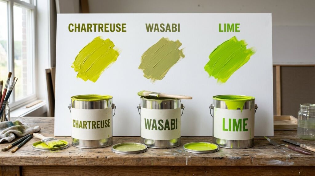
What is the difference between lime green and chartreuse?
Chartreuse has more yellow. Lime green is a true green. Chartreuse feels warmer and more like a metal finish. Lime green feels more like a plastic or a fruit. Chartreuse is generally considered more “high end” in the design world.
Does chartreuse go with gold or silver?
Gold and brass are the best matches. The yellow undertones in the green love the warmth of gold. Silver or chrome can look a bit cold. If you want a modern look go with matte black hardware instead.
Can I paint my front door this color?
Absolutely. It is a bold move that pays off. It makes your house easy to find. Just make sure your house body color is neutral like navy, white, or charcoal. A green door on a red house will look like a holiday theme.
What color goes with chartreuse in a kitchen?
Black and white are the winners here. White cabinets with black handles and a green island is a perfect trio. It feels clean and modern but has a massive personality.
Is wasabi green the same as chartreuse?
They are very close. Wasabi green usually has a tiny bit more grey or brown in it. It is a “dirtier” version of chartreuse. This makes it easier to use on large surfaces like walls because it is less neon.
Can I use this color in a nursery?
Yes. It is a great gender neutral option. It is bright and happy. Pair it with soft greys and whites to keep it calm for the baby. Avoid using it on all walls to prevent overstimulation.
What color goes with chartreuse for an office?
I love it with dark wood and leather. A green chair next to a leather desk pad looks very professional. It provides enough energy to keep you awake during a long workday.
Will this color hurt my resale value?
If you use it as an accent no. If you paint the whole house wasabi green maybe. Keep the permanent things neutral. Use the color for things that are easy to change. This gives you the best of both worlds.
Final Thoughts on the Electric Chartreuse Trend
Using bold colors is an act of bravery. We spend so much time worrying about what others think. We forget that our homes should make us happy. Chartreuse is a happy color. It represents growth and energy.
I have seen it change the mood of a house in one afternoon. Whether you choose a small vase or a large velvet sofa you are making a statement. You are saying that your space matters.
Start with one small thing. See how it looks at noon and at night. If it makes you smile keep going. This is the only rule in design that matters. Your home should be a reflection of you. Not a reflection of a beige showroom.