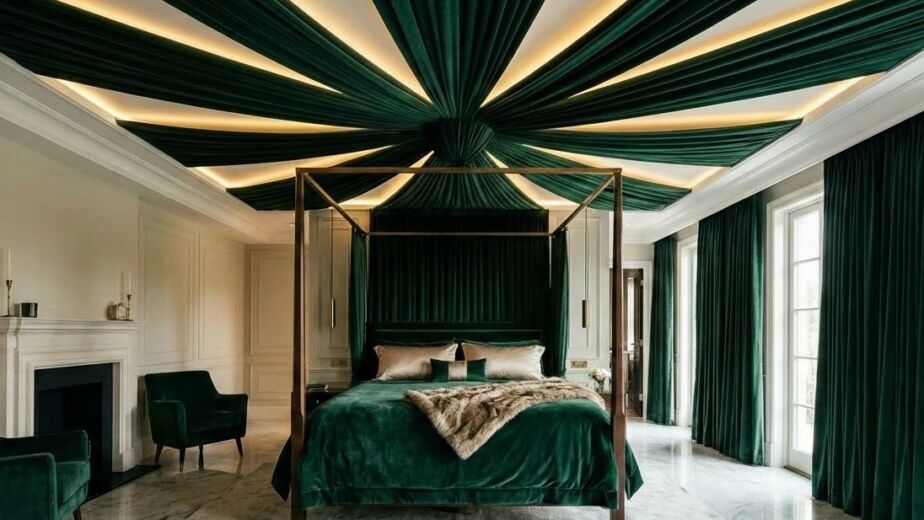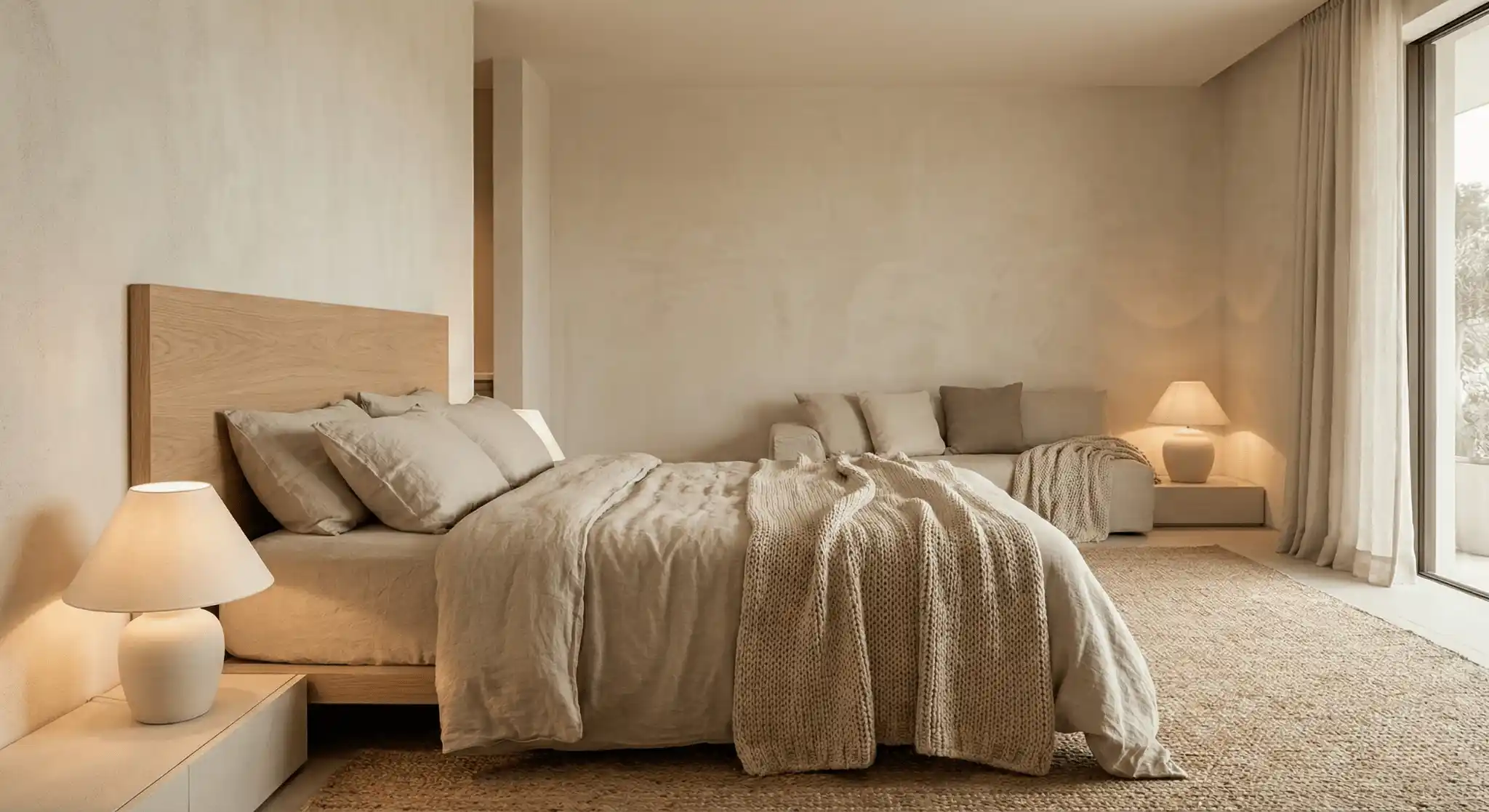
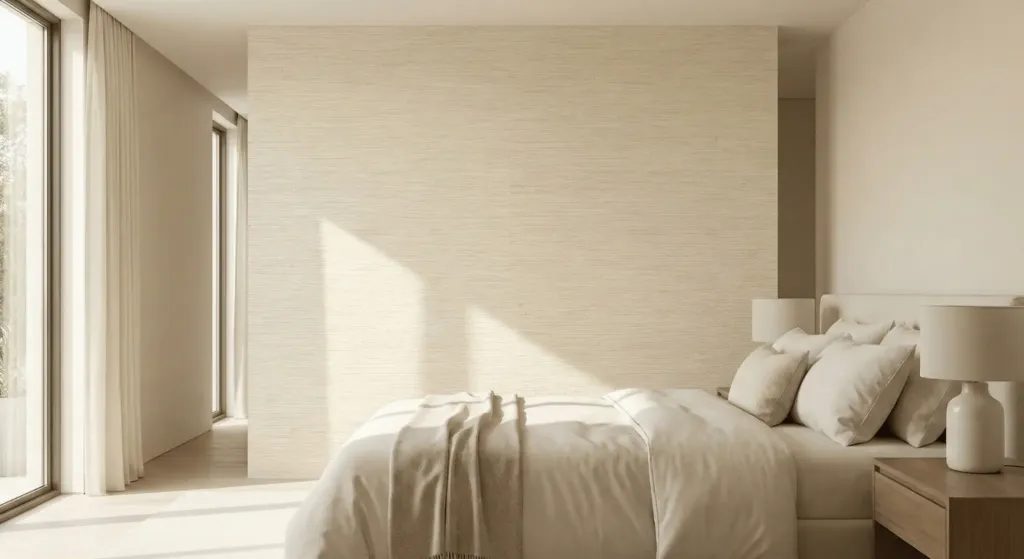
Imagine waking up in a room that feels like a warm hug. Your feet hit a soft wool rug. The walls glow with a creamy light. There is no visual clutter. This is the power of a neutral palette. Most people think neutral means boring. They think of sterile hotel rooms or hospital walls. That is a mistake. I spent ten years as an interior stylist. I saw many people fail at this. They bought a beige bed and beige curtains. Their room looked flat. It lacked soul. Neutral design is not about a lack of color. It is about the presence of texture and light.
Last year I helped a client named Mark. He lived in a high stress city. He could not sleep. His bedroom was bright blue with heavy metal furniture. We stripped it down. We used oatmeal tones and reclaimed wood. Within two weeks he told me his heart rate dropped the moment he walked through the door. This guide gives you the exact steps to get that result. We will look at specific paint codes. We will talk about fabric weights. You will learn how to mix old and new. These 21 ideas will change how you see your home.
1. Layer Warm and Cool Greige
Greige is the perfect middle ground. It sits between grey and beige. Pure grey can feel cold in winter. Pure beige can look yellow under LED bulbs. I always recommend Sherwin Williams Agreeable Gray or Benjamin Moore Revere Pewter. These shades shift with the sun. Start with a darker greige on the walls. Use a lighter version for the ceiling. This creates a cocoon effect. It makes the room feel taller.
In my first apartment I painted everything stark white. It felt like a lab. I repainted with a warm greige. The space felt instantly expensive. Do not be afraid of depth. A slightly darker wall makes white furniture pop. It provides a backdrop for your life. Use matte finishes to hide wall flaws.
2. Mix Heavy Linen with Light Cotton
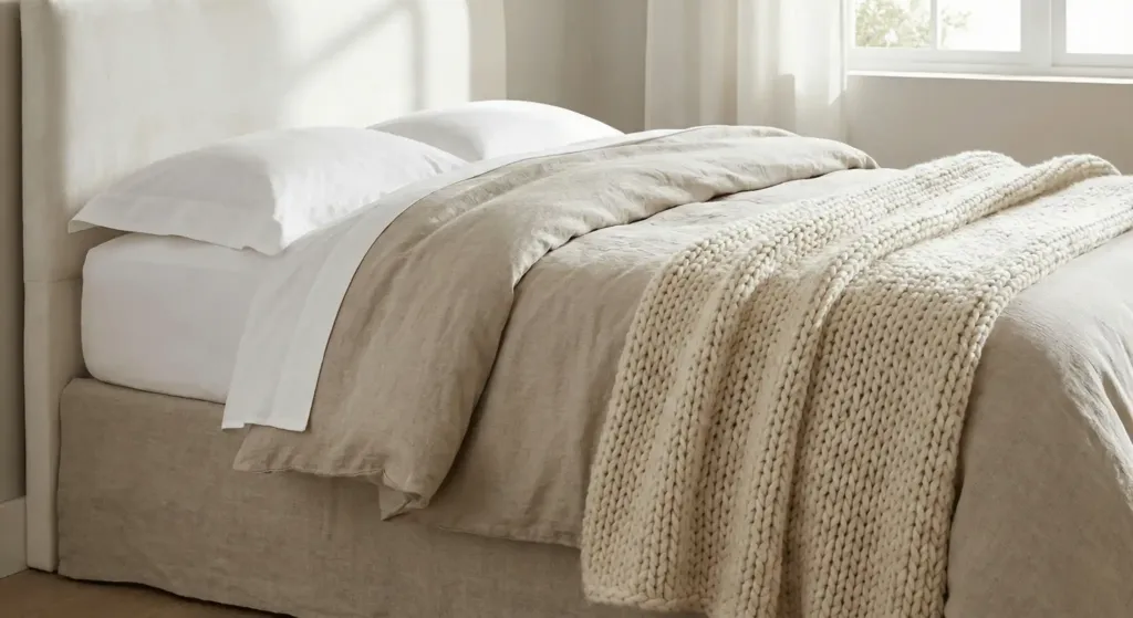
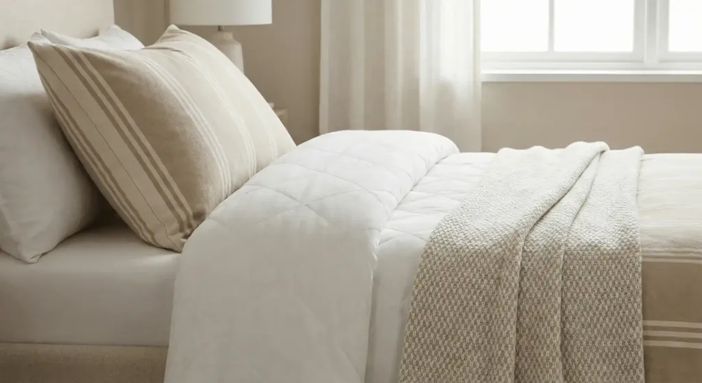
Texture is the secret to neutral rooms. If every fabric is smooth the room feels dead. I use the 3 layer rule. Start with crisp cotton sheets. Add a heavy linen duvet. Finish with a chunky wool throw. This creates visual weight. Linen has a natural wrinkle. It tells the eye that the room is for living.
I once worked on a coastal home in Florida. We used only white fabrics. We kept it interesting by mixing textures. We paired a velvet headboard with a rough linen bed skirt. The contrast was beautiful. It felt rich without using a single bright color.
3. Introduce Natural Wood Grains
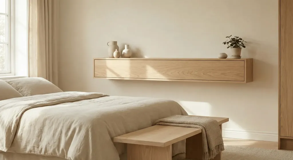
Neutral tones need organic elements. Wood adds warmth that paint cannot mimic. Look for light oak or birch. Avoid orange toned woods like cherry or dark mahogany for this look. A floating wood shelf or a wooden bench at the foot of the bed works well.
I saw a DIY failure where a friend stained their pine furniture dark walnut. It clashed with the soft cream walls. We sanded it back to the natural light grain. The room felt light again. Natural wood connects the indoors to the outside. It brings a sense of peace.
4. Use Matte Black for Small Accents
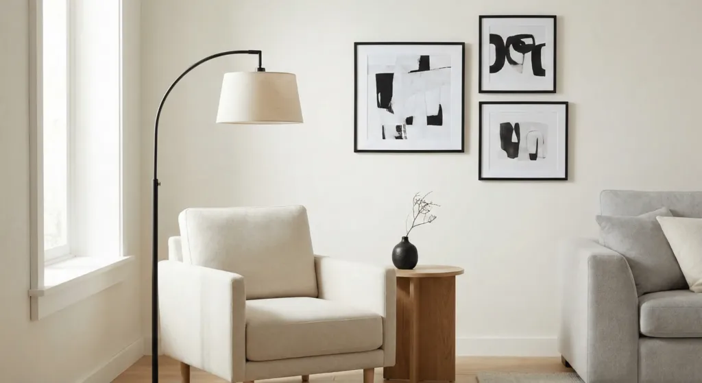
A room with only light tones can feel ungrounded. You need a “black point.” This is a small area of dark color that anchors the space. Think of thin black picture frames or a matte black floor lamp. This creates a focal point. It draws the eye around the room.
I suggest using brands like Schoolhouse or Rejuvenation for lighting. Their black finishes are smooth and high quality. Avoid shiny plastic. You only need two or three black items. More than that will overwhelm the soft neutrals.
5. Incorporate Jute or Sisal Rugs
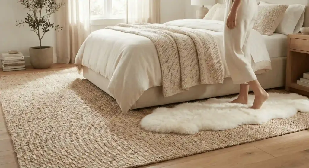
Rugs define the area. In a neutral bedroom a large jute rug provides a rugged base. It adds a different tactile experience. If jute feels too scratchy for your feet try a “layering” trick. Place a large jute rug down first. Put a smaller plush sheepskin rug right where you step out of bed.
I used this in a guest room makeover last summer. The room had cold tile floors. The jute rug covered the tile. The sheepskin added the comfort. It looked professional and felt cozy. Jute is also very durable. It lasts for years.
6. Install Sculptural Plaster Art
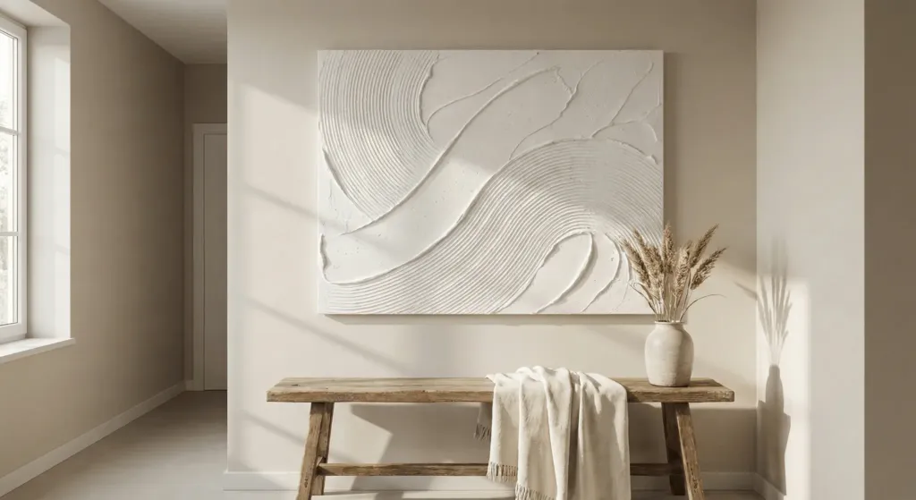
Large colorful paintings can ruin a neutral vibe. Instead look for 3D art. Plaster art uses white or cream materials to create shadows. You can even make this yourself. I once spent a weekend with a canvas and joint compound. I made a large textured piece for my hallway. It looks like a gallery find.
Shadows are your friend in neutral design. When the sun hits a textured white canvas the art changes. It stays interesting all day long. It does not demand attention like a red or yellow painting. It invites you to look closer.
7. Choose Low Profile Furniture
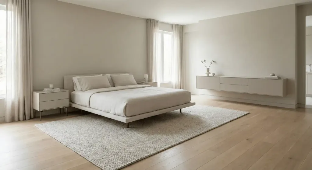
Neutral rooms work best when they feel airy. Bulky furniture blocks the flow. Choose a bed frame that sits low to the ground. Use nightstands with slim legs. This allows you to see more of the floor. Seeing more floor space makes a room feel larger.
In a small studio project I did in 2024 we swapped a heavy dresser for a wall mounted unit. We kept the colors identical to the wall. The furniture almost disappeared. This reduced visual noise. It made the small space feel like a suite.
8. Focus on Circadian Lighting

Light is a color. Your neutral paint will look different at 8 AM and 8 PM. Avoid “Daylight” bulbs which are blue. They make beige look like mud. Use “Warm White” bulbs around 2700K. I love the Phillips Hue system. You can dim the lights as the sun goes down.
Good lighting helps your sleep cycle. In a neutral room light bounces off every surface. Soft yellow light makes a cream room feel like gold. This is essential for a restful environment. Never rely on a single overhead light. Use at least three light sources.
9. Add Toned Metallic Details
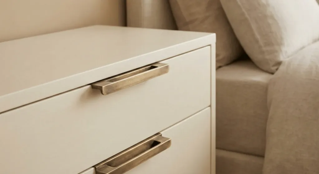
Metals act like jewelry for a room. For neutral spaces I prefer brushed brass or champagne gold. These metals have a warm undertone. They melt into beige and cream. Chrome or silver can feel too sharp.
I once replaced all the silver knobs in a bedroom with aged brass handles from Etsy. The change cost fifty dollars. It made the old IKEA dresser look like a custom piece. Small details build the expert look.
10. Frame the Windows with Linen Drapes

Windows are the eyes of the room. Do not hide them with heavy velvet. Use sheer linen drapes. These allow natural light to filter through. They provide privacy without making the room dark.
Hang the curtain rod higher and wider than the actual window. This makes the window look massive. It creates a sense of luxury. I always buy drapes that are 10 inches longer than I need. I let them “puddle” on the floor. It looks soft and romantic.
11. Integrate Biophilic Elements
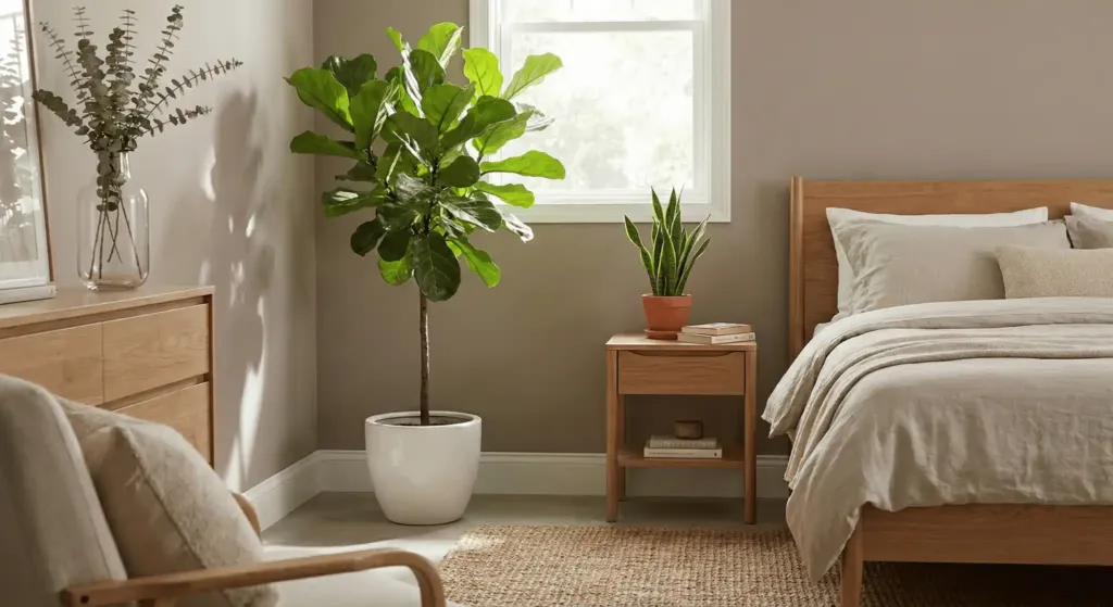
Biophilic design means bringing nature inside. A single green plant looks incredible against a taupe wall. Use a large Fiddle Leaf Fig or a simple Snake Plant. The green acts as a “natural neutral.”
Plants also clean the air. I kept a peace lily in my bedroom for years. It survived low light and looked great in a white ceramic pot. If you lack a green thumb use dried branches in a tall vase. Eucalyptus or pampas grass works well.
12. Create a Monochromatic Feature Wall
A feature wall does not have to be a different color. It can be a different texture. Try vertical wood slats painted the same color as the wall. Or use a subtle grasscloth wallpaper. This adds depth without adding “noise.”
I used a cream grasscloth in a master suite redo. The texture caught the morning light beautifully. It felt much more high end than just flat paint. It is a subtle way to show expertise in design.
13. Layer Multiple Rugs for Comfort

We talked about jute but do not stop there. Layering rugs is a pro move. Use a thin flatweave rug as the base. Put a thicker wool rug on top. Offset them slightly. This adds a “designer” touch to the floor.
I once saw a room where the rug was too small. It looked like a postage stamp. We added a large sisal rug underneath. It filled the space and fixed the scale. Always buy a rug larger than you think you need.
14. Select an Oversized Upholstered Headboard
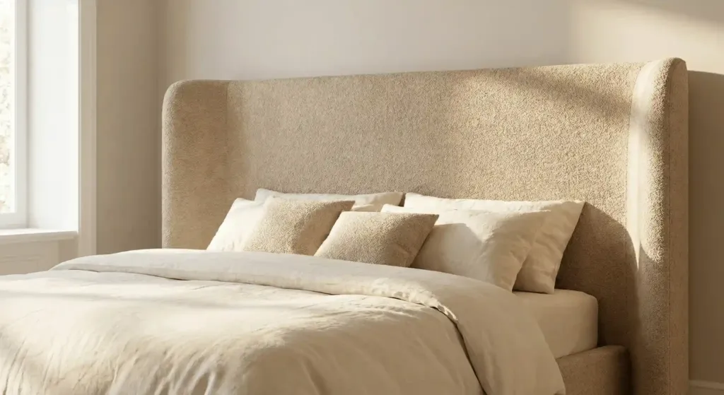
The bed is the heart of the room. A large upholstered headboard in a light fabric makes a statement. Choose a fabric with a visible weave like bouclé. This fabric is very popular in 2026. It feels soft and looks modern.
In my own bedroom I chose a tall headboard in a sand color. It makes the bed feel like a destination. It is also more comfortable for reading at night. Avoid leather headboards as they can feel cold.
15. Utilize Hidden Storage

Clutter kills the neutral vibe. If you have piles of clothes the room is not calm. Choose a bed with drawers underneath. Use a nightstand with a door to hide your phone chargers and books.
I tell my clients to do a “clear surface” test. Every morning clear every surface except for one lamp and one plant. This small habit keeps the design looking sharp. Use brands like West Elm for stylish storage beds.
16. Incorporate Woven Rattan Accents
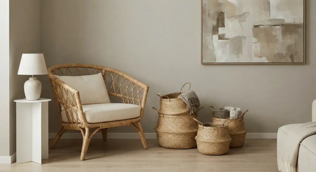
Rattan adds a vintage feel. It breaks up the straight lines of modern furniture. A rattan chair in the corner or a set of woven baskets for pillows adds a handmade feel. It keeps the room from looking too “perfect” or “catalog-like.”
I found a vintage rattan stool at a flea market for ten dollars. I cleaned it and put it in a modern neutral room. It became the most talked about piece. Mixing old and new is a mark of a great designer.
17. Experiment with Tonal Patterns
You can use patterns in a neutral room. Just keep the colors the same. Think of a beige pillow with a cream stripe. Or a white duvet with a subtle diamond stitch. These patterns add visual interest without being loud.
Patterns prevent the room from looking flat. I like to mix three patterns. One large scale like a wide stripe. One medium scale like a geometric knit. One small scale like a dot or a weave. Keep them all in the same color family.
18. Add a Built-in Reading Nook
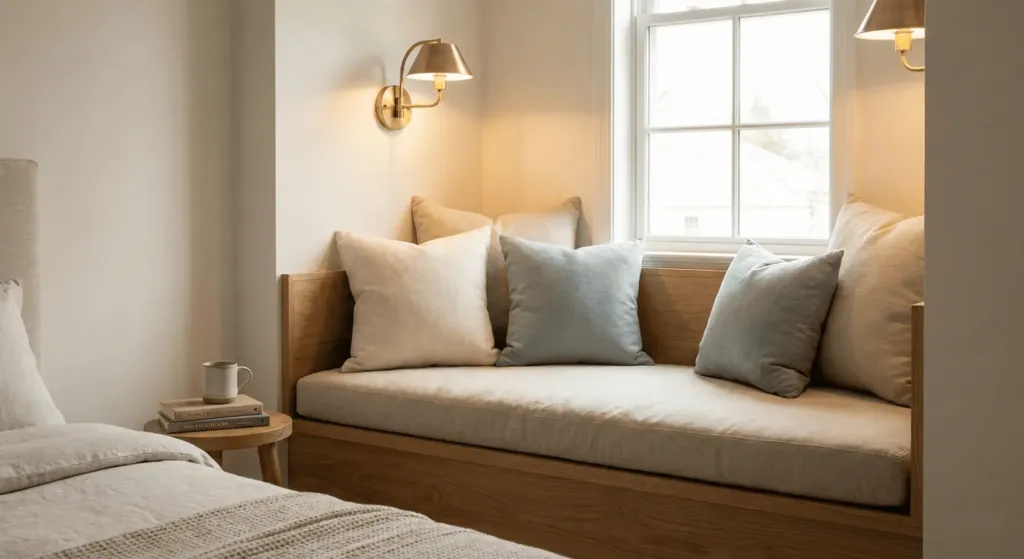
If you have an awkward corner turn it into a nook. Add a small bench with a neutral cushion. Install a wall sconce. This makes the bedroom more than just a place to sleep. It becomes a retreat.
I did this in a guest room that had a weird alcove. We added a custom bench and some linen pillows. Now the owners spend every morning there with coffee. It added value to their home and joy to their life.
19. Use Large Scale Minimalist Mirrors
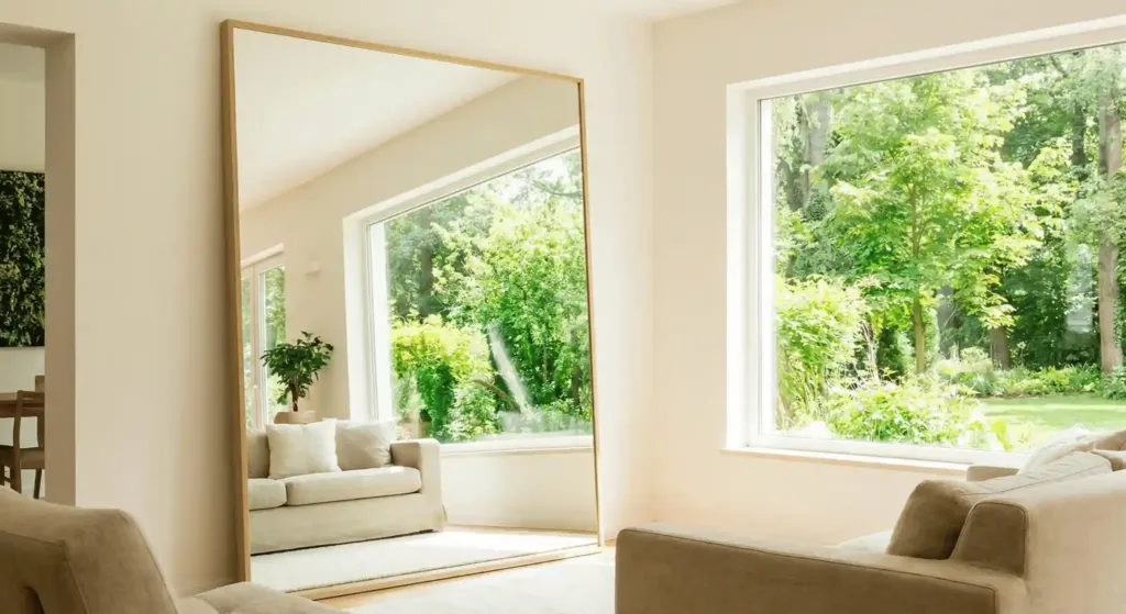
Mirrors bounce light. In a neutral room this is vital. A large floor mirror with a thin wood frame makes the room feel twice as big. It also lets you see the different shades of your walls from different angles.
I once placed a mirror opposite a window. It brought the view of the trees inside. The green from the trees looked great against the cream walls. It felt like living in a garden. Use mirrors to solve dark corner problems.
20. Paint the Ceiling a Soft White
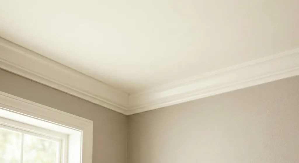
Never use “Ceiling White” from a can. It usually has a blue tint. Use the same white as your trim but in a flat finish. This makes the transition from wall to ceiling soft. It avoids a harsh line at the top of the room.
I made the mistake of using a “Bright White” on a ceiling once. It made the warm beige walls look dirty. I had to repaint it. Always coordinate your whites. A creamy ceiling makes the room feel cohesive.
21. Curate Sensory Details
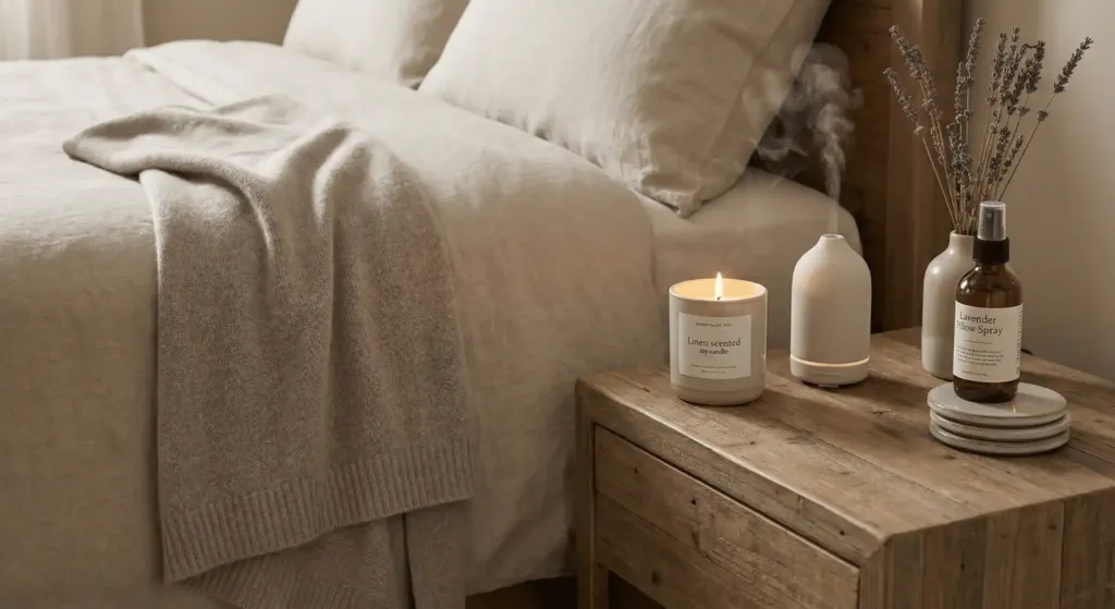
Design is not just for the eyes. A neutral room should smell and feel good. Use a linen scented candle or an essential oil diffuser. Keep a soft cashmere throw at the end of the bed. These details finish the experience.
I use a lavender spray on my pillows every night. It matches the calm look of my room. When your senses are aligned you sleep better. This is the goal of interior design. It is about how you feel inside the space.
Comparison of Popular Neutral Paint Brands
| Brand | Recommended Shade | Undertone | Best For |
| Benjamin Moore | Swiss Coffee | Warm Cream | Traditional homes |
| Sherwin Williams | Alabaster | Soft White | Modern Minimalist |
| Farrow & Ball | Skimming Stone | Grey-Beige | North-facing rooms |
| Behr | Blank Canvas | True Neutral | Any light condition |
Case Study: The Small Apartment Transformation
A client named Sarah lived in a 400 square foot studio. The walls were a dark yellow. The furniture was a mix of black plastic and dark wood. She felt cramped. We spent $1,200 on a neutral makeover.
First we painted the walls Alabaster by Sherwin Williams. This cost $150. Then we bought a light oak bed frame from IKEA for $400. We added linen bedding from West Elm for $300. Finally we added a large jute rug and some plants.
The result was shocking. Sarah said the room felt twice as big. She started hosting friends for tea. She stopped feeling stressed at home. We did not move a single wall. We just changed the tones and textures. This proves that you do not need a big budget to have a high end room.
Expert Tips for Neutral Success
- Avoid the hospital look: Use at least five different textures.
- Check your light: Look at paint samples at night under your lamps.
- Scale matters: One large piece of art is better than ten small ones.
- Stay organized: A neutral room shows dust and clutter quickly.
- Don’t rush: Buy one piece at a time to ensure the tones match.
Frequently Asked Questions
How do I keep a neutral bedroom from looking boring?
The key is texture. Mix materials like wood, wool, linen, and metal. Use different shades of the same color. A room with beige, cream, and tan looks more interesting than a room with only one shade of beige. Adding a single black accent or a green plant also helps.
What is the best white paint for a bedroom?
I highly recommend Sherwin Williams Alabaster or Benjamin Moore White Dove. These are warm whites. They do not look clinical or cold. They have a small amount of yellow or grey that makes them feel soft and inviting.
Can I use neutrals in a room with no natural light?
Yes. In fact neutrals can help. Light colors reflect what little light you have. Use mirrors to bounce light from other rooms. Focus on high quality artificial lighting with warm bulbs. Avoid cool greys in dark rooms as they can look depressing.
Is a neutral bedroom hard to keep clean?
Light fabrics do show stains more than dark ones. However many modern fabrics are performance grade. You can buy washable rug covers or bleach linen sheets. I find that a light room actually encourages me to stay organized. I see the mess faster and clean it up immediately.
What accent colors go best with neutral tones?
I love using “earthy” accents. Think of terracotta, sage green, or muted ochre. These colors occur in nature. They complement wood and cream beautifully. If you want something cooler try a dusty blue or a soft slate.
How much does a neutral room makeover cost?
You can start small. A gallon of paint and some new pillow covers cost under $200. A full room overhaul with a new bed and rug might cost $2,000 to $5,000. It depends on the brands you choose. I recommend spending the most on your mattress and your rug.
Designing a bedroom with neutral tones is a gift to yourself. It is a commitment to rest. I have seen these changes transform lives. People sleep better. They argue less. They feel a sense of pride.
Start with one thing. Maybe it is a new set of sheets. Maybe it is a gallon of paint. Notice how the light hits the new surface. Notice how your mood changes. You deserve a space that supports your peace.
What is the biggest challenge you face with your current bedroom? Are you afraid of white? Do you have too much stuff? Start there. Use these 21 ideas as a map. You will be surprised at how quickly your home can change.