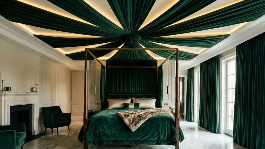
You walk into a room. It feels like a hug. The walls are soft. The sofa looks like a cloud. Nothing screams for your attention. This is the power of a neutral space. Many people think neutral means boring. They think it means beige and flat. I used to think that too. In 2021, I painted my entire living room a cool gray. I thought it would look modern. Instead, it looked like a cold office. I hated it for six months. Then I learned about undertones and texture. I fixed it for under 500 dollars. Now, that room is my favorite place to be. You can create a space that feels rich without spending a fortune. It just takes a plan. These 22 ideas will help you get the look you want.
What makes a neutral room feel warm instead of cold?
A warm neutral room uses colors with yellow, red, or orange bases. You should avoid blues or greens in your base paints. Use materials like wood, wool, and leather to add natural heat. Lighting is the final step. Always choose bulbs with a warm color temperature.
I learned this the hard way during a kitchen remodel. I bought “white” tiles that turned blue at night. It made the whole house feel like a hospital. To fix a cold room, stop looking at the walls. Look at your floor. A large jute rug adds instant warmth. Wood tones act like a neutral but feel like a color. I suggest adding three different wood grains to every room. Put a walnut side table next to an oak floor. Add a pine bowl on the coffee table. These layers stop the room from feeling flat. My friend Sarah did this in her rental. She could not paint the white walls. She added a cognac leather chair and a wool rug. The room went from cold to cozy in one day.
1. Layer different shades of white
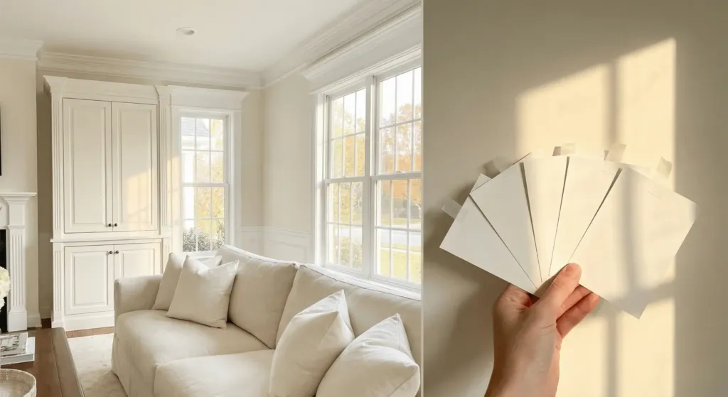
You should never use just one white. Mix cream, ivory, and alabaster to create depth. Use the darkest white on your largest furniture. Use the brightest white on your trim. This creates a subtle contrast that looks expensive.
In 2023, I helped a client who wanted a “pure white” room. We used Sherwin-Williams Alabaster on the walls. We picked Benjamin Moore Swiss Coffee for the cabinets. The slight shift in tones made the room feel architectural. If you use one flat white, the room disappears. When you layer shades, your eyes see the shapes of the furniture. I recommend getting five paint swatches. Tape them to your wall. Watch how they change at 4 PM. That is when the true colors show up.
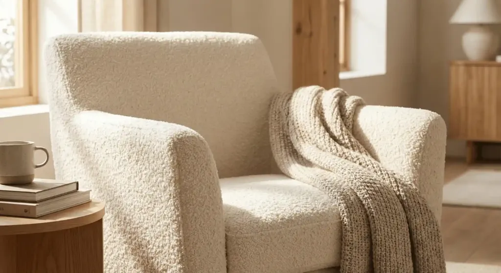
2. Incorporate cognac leather furniture
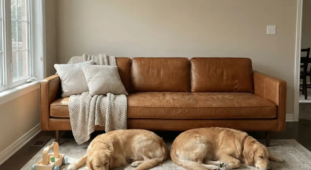
Leather acts as a neutral but brings a rich texture. Cognac or camel colors break up a beige room without adding “color.” It wears well over time and handles spills better than fabric.
I bought a cognac leather sofa from Article three years ago. I have two dogs and a toddler. That sofa looks better now than it did when it arrived. The scratches blend into the patina. In a neutral room, leather provides a visual anchor. It gives the eye a place to rest. If a full sofa is too much, try a leather ottoman. You can find great ones at West Elm or Pottery Barn. Expect to pay 300 to 800 dollars for a quality leather chair. It is an investment that lasts a decade.
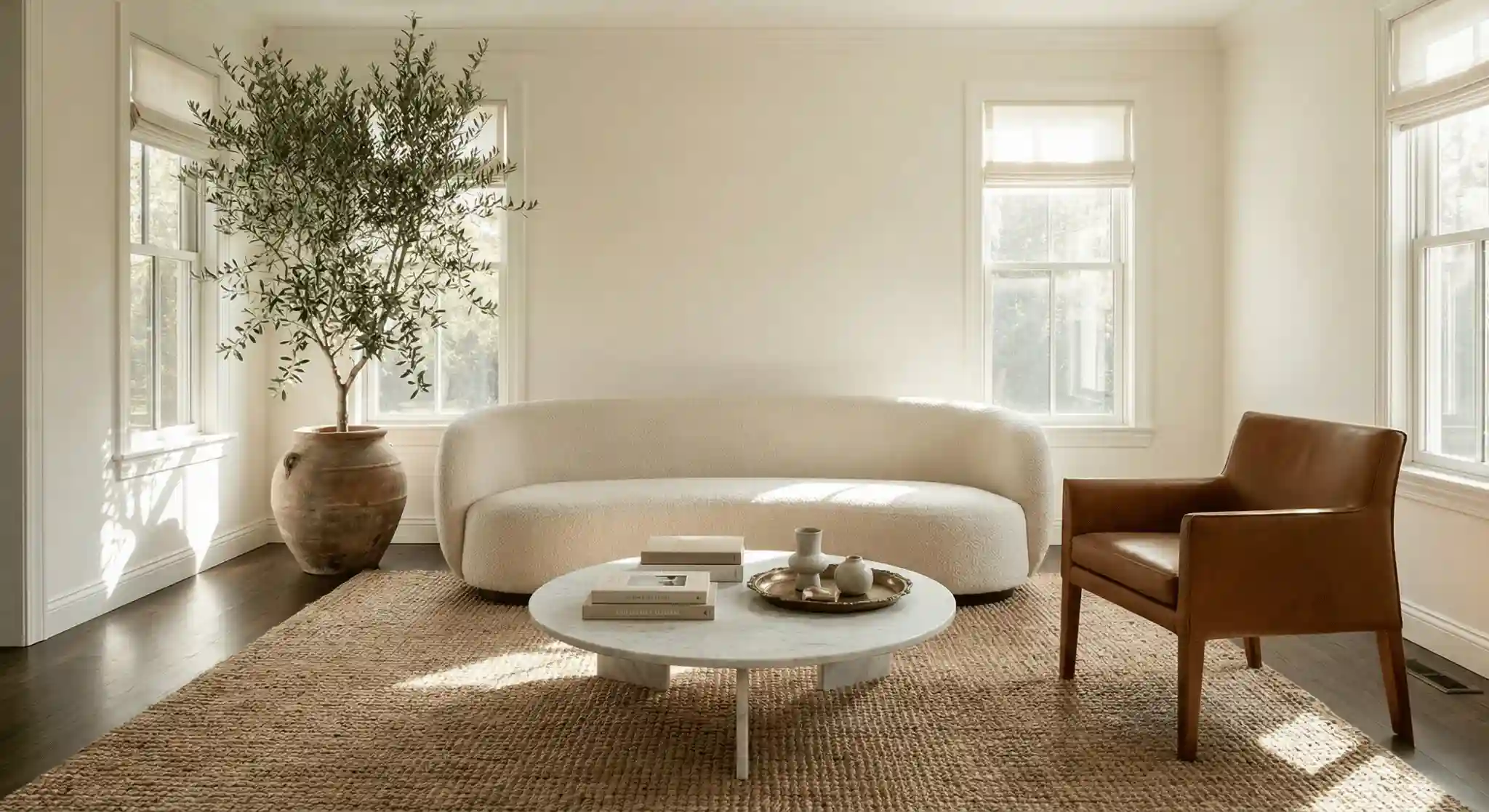
3. Use oversized jute or sisal rugs
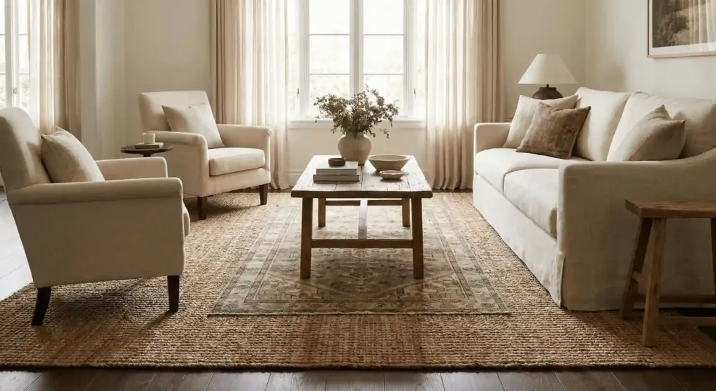
Natural fiber rugs provide the best foundation for neutral designs. They add a rough texture that balances soft fabrics. Jute is softer on feet, while sisal is more durable for high traffic areas.
Most people buy rugs that are too small. This is a huge mistake. Your rug should be big enough for all furniture legs to sit on it. I found a 9 by 12 jute rug at HomeGoods for 250 dollars. It changed the entire scale of my living room. It made the room feel twice as big. If you want a softer feel, layer a small wool rug on top of the jute. This is a classic designer trick. It looks layered and intentional.
4. Mix matte black metal accents
Neutral rooms need a bit of “weight.” Matte black hardware or light fixtures provide this. It grounds the light colors and adds a modern edge. Think of it like eyeliner for your room.
I replaced all the silver knobs in my living room with matte black ones. I spent 40 dollars total. The room immediately looked more “designed.” You can find black metal frames at Target or IKEA. Use them for a gallery wall. The black lines create a grid that keeps the neutrals from floating away. Just don’t overdo it. Two or three black pieces are enough for a standard room.
5. Bring in raw wood elements
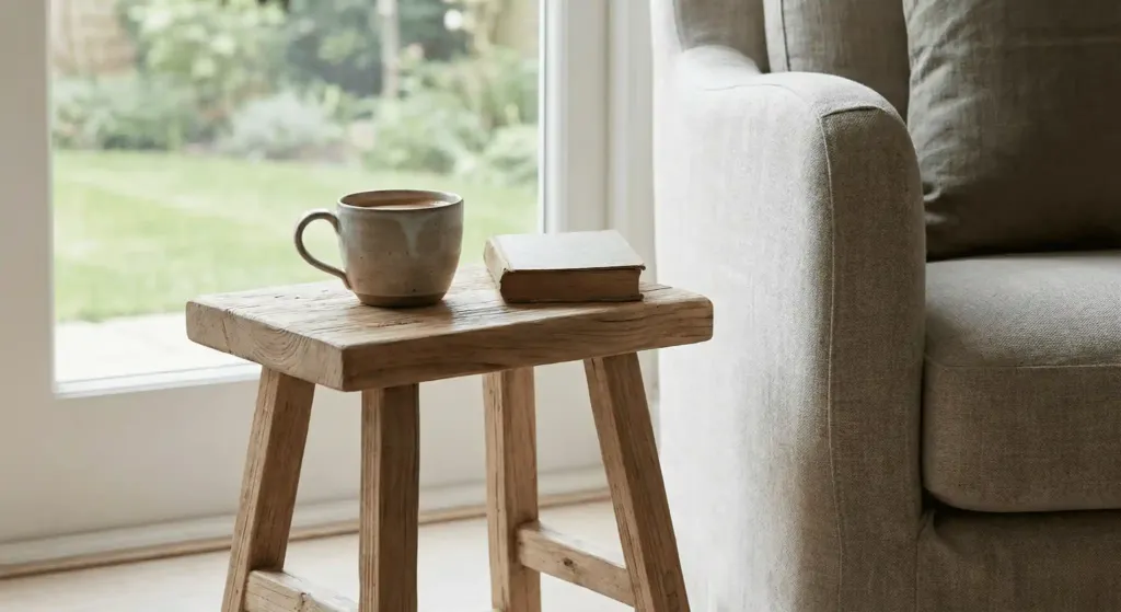
Raw wood has a matte finish that feels organic. It connects the indoors to the outside. Look for white oak or reclaimed pine. Avoid high gloss finishes which can look dated.
I found a raw wood stool at a local flea market for 15 dollars. I sanded it down and left it natural. I use it as a side table for my coffee. It adds a “wabi-sabi” feel to the space. You can also add wood beams to the ceiling if you have the budget. This costs around 2,000 to 5,000 dollars but adds massive value to your home. [Internal Link: How to style a wooden coffee table].
6. Try bouclé fabrics for chairs
Bouclé is a looped yarn fabric. It is very popular right now for a reason. It adds a bumpy texture that catches the light. It makes a white chair look interesting instead of plain.
I tested a bouclé chair from CB2 last year. It feels like sitting on a teddy bear. Even in a pale cream color, the texture makes it stand out. It hides small crumbs well because of the loops. However, be careful if you have cats. Their claws can snag the loops easily. If you have pets, look for a “performance bouclé.”
7. Paint the ceiling a soft tan
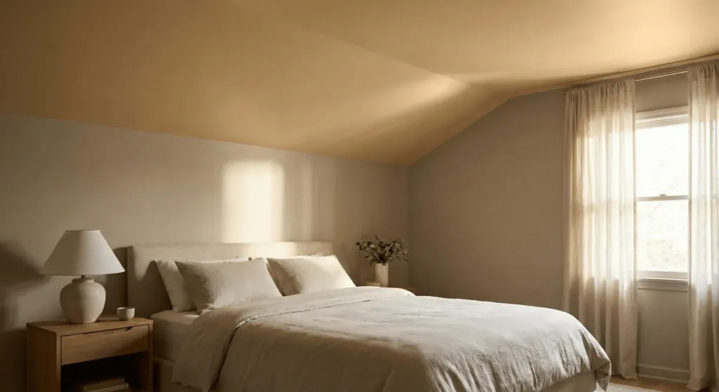
The ceiling is the “fifth wall.” Most people paint it flat white. In a neutral room, a soft tan ceiling makes the space feel intimate. It draws the eye up and creates a glow.
I tried this in my guest bedroom. I used a color called “Kitten Whisker.” It is a very light taupe. When the sun hits it, the whole room turns warm. It cost me 50 dollars for one gallon of paint and two hours of work. It is the best high-impact, low-cost hack I know. Use a flat finish to hide any bumps in the drywall.
8. Hang linen curtains high and wide
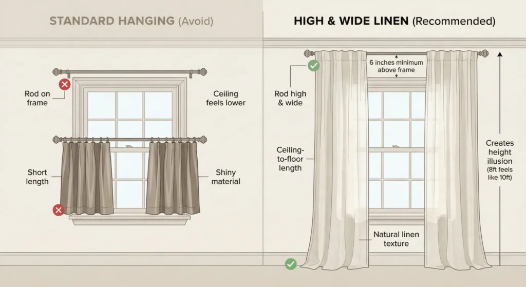
Linen allows soft light to filter through. It has a natural wrinkle that looks relaxed. Hang your curtain rod 6 inches above the window frame. This makes your ceilings look much taller.
I bought linen panels from H&M Home for 60 dollars. I hung them from the ceiling down to the floor. My 8-foot ceilings now look like 10-foot ceilings. Avoid shiny polyester curtains. They look cheap in a neutral room. Stick to flax or off-white colors. [Internal Link: Window treatment guide for beginners].
9. Use stone coffee tables
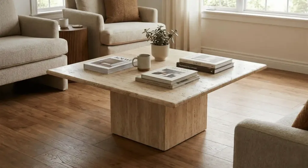
Marble, travertine, or limestone tables add a cold texture that balances warm woods. The natural veining in stone provides a subtle pattern. This keeps the room from looking too perfect.
I found a vintage travertine table on Facebook Marketplace for 100 dollars. New ones at Restoration Hardware cost over 2,000 dollars. Stone is heavy and feels permanent. It grounds the room. If you buy marble, make sure to seal it. Lemon juice or wine will stain it in seconds. I use a stone sealer from Home Depot once a year.
10. Add green plants for life
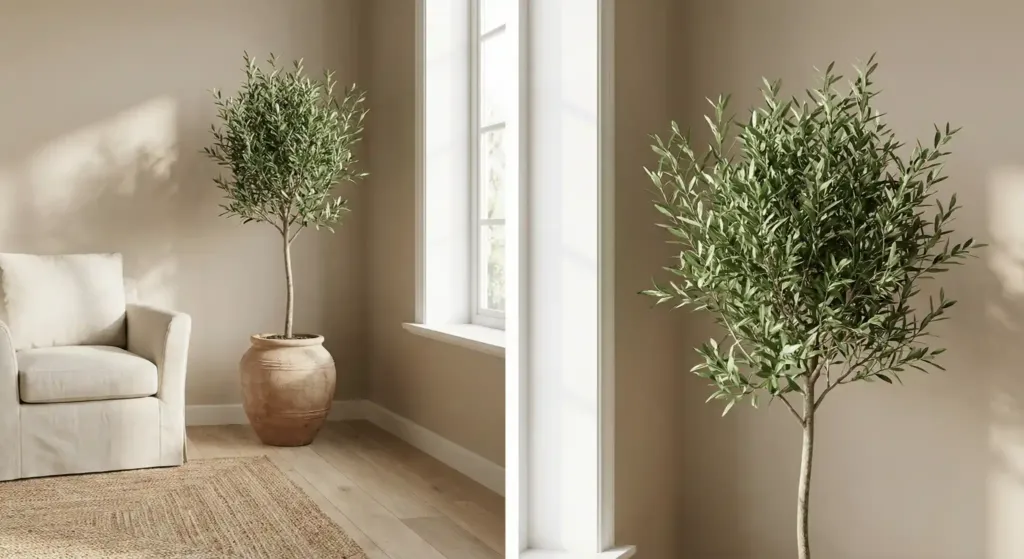
A neutral room needs something living. Green is a neutral in nature. A large fiddle leaf fig or an olive tree adds height and color. It breaks up the beige without clashing.
I have an olive tree in the corner of my living room. It cost 150 dollars at a nursery. I used a terracotta pot to add more earth tones. If you can’t keep plants alive, try high-quality silk ones from Afloral. Cheap fake plants will ruin the look of a high-end room. Spend the extra money on a realistic trunk.
11. Group ceramics by color
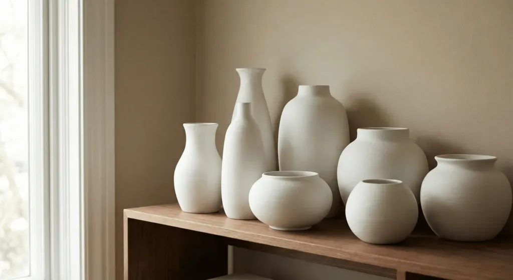
Display your collections in clusters. If you have white vases, put them all together. This creates a “moment” of texture. It looks like a curated gallery instead of clutter.
I collect matte white pottery. I keep them on my bookshelf. I mix tall ones with short ones. Because they are all the same color, the different shapes become the focus. You can find great ceramics at West Elm or even thrift stores. I often buy ugly colored vases and spray paint them matte sand. It is a 5-dollar fix for a high-end look.
12. Pick performance velvet for sofas
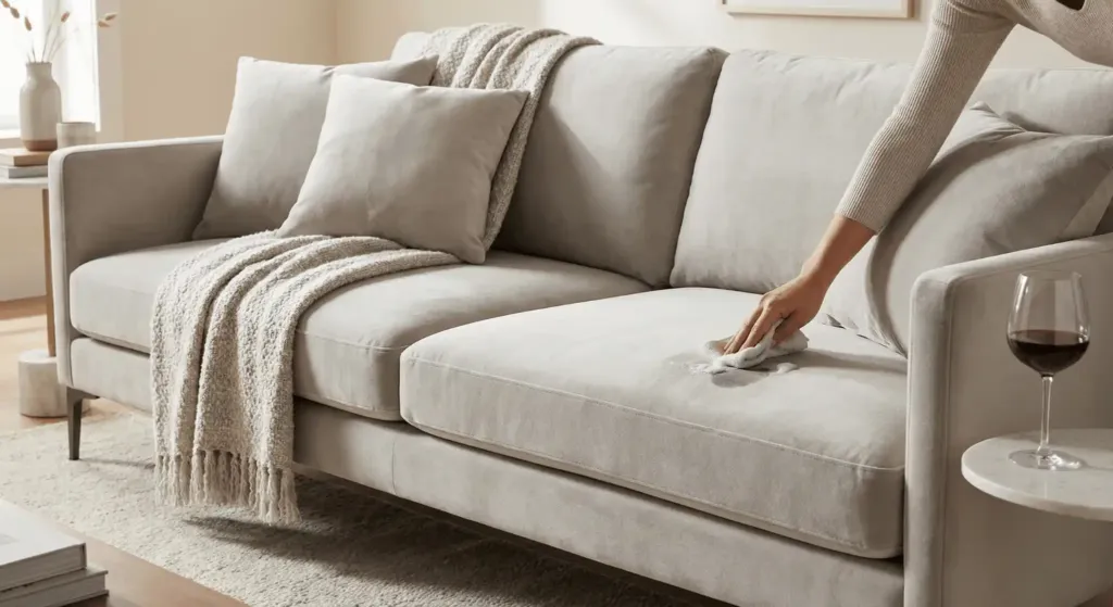
Velvet has a sheen that reflects light. In a neutral tone like “Oatmeal” or “Pewter,” it looks very rich. Performance velvet is easy to clean. You can scrub it with soap and water.
I once spilled red wine on my light gray velvet sofa. I panicked. I used a damp cloth and some dish soap. The stain came right out. This is why I always recommend performance fabrics for families. Brands like Joybird and Burrow offer great options. A good sofa will cost 1,500 to 3,000 dollars. [External Link: Architectural Digest Guide to Performance Fabrics].
13. Layer a hide rug over wool
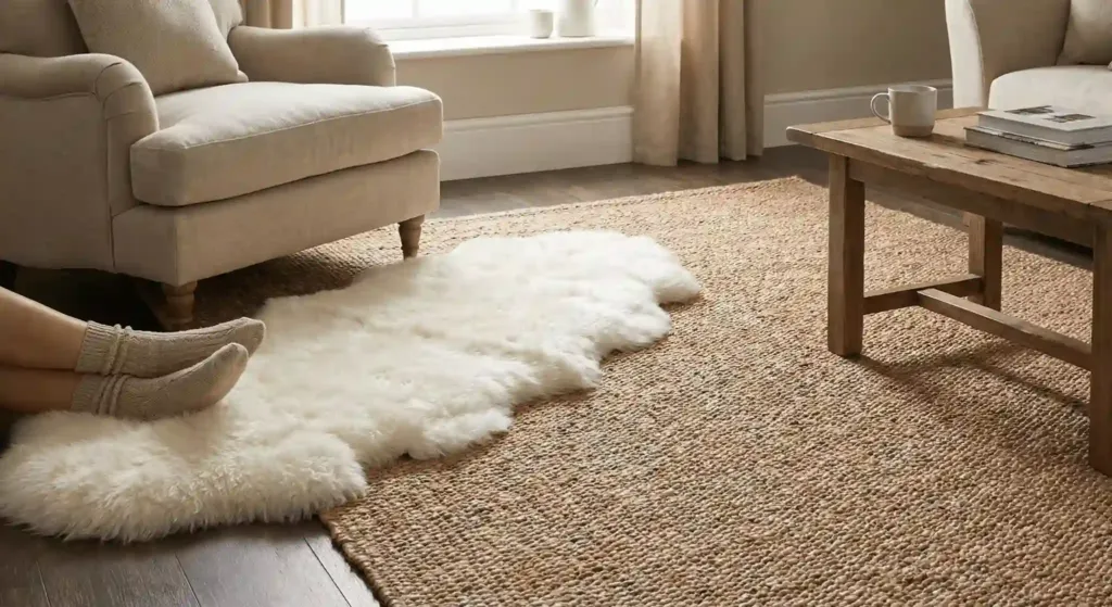
A faux cowhide or sheepskin adds an organic shape. Neutral rooms often have too many squares and rectangles. A hide breaks those lines.
I put a white sheepskin from IKEA over my jute rug. It cost 40 dollars. It adds a layer of softness where I put my feet. It also makes the room look more “layered.” Designers do this to make a space feel lived-in. It stops the room from looking like a furniture showroom.
14. Install warm brass hardware
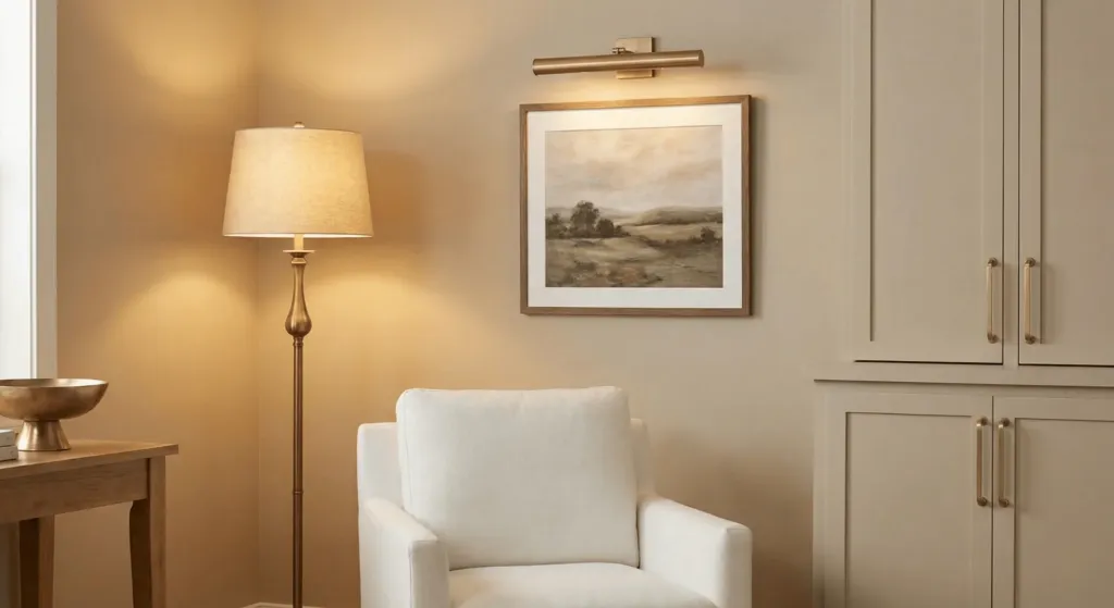
Brass is the “gold” of neutral design. It adds a tiny bit of shine. Warm brass looks great against white and beige. Avoid “shiny” brass which can look like the 1980s. Look for “antique” or “satin” brass.
I changed my floor lamp to a brass one from Target. It cost 80 dollars. The gold tone glows when the light is on. It acts like jewelry for the room. You can also add brass picture lights above your art. This makes the art look like it belongs in a museum.
15. Use textured wallpaper on one wall
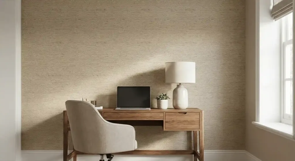
Grasscloth wallpaper is a neutral lover’s dream. It is made of real woven fibers. It adds a massive amount of texture to a wall. It is expensive, so start with just one wall.
I installed grasscloth in a small nook behind my desk. It cost 300 dollars for the paper and glue. It makes that tiny space feel like a high-end hotel. If you are a renter, try peel-and-stick versions from Chasing Paper. They are easier to remove and cost less. [Internal Link: DIY wallpaper tips].
16. Create a tonal gallery wall
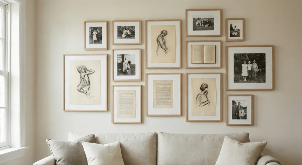
You can hang art in a neutral room without using bright colors. Use black and white photos. Use sketches on cream paper. Use frames that match your wall color.
I made a gallery wall using old book pages and simple wood frames. I spent 30 dollars at a thrift store on the frames. By keeping the colors the same, the focus stays on the shapes. It feels calm rather than busy. Space your frames exactly 2 inches apart for a clean look.
17. Switch to warm LED bulbs
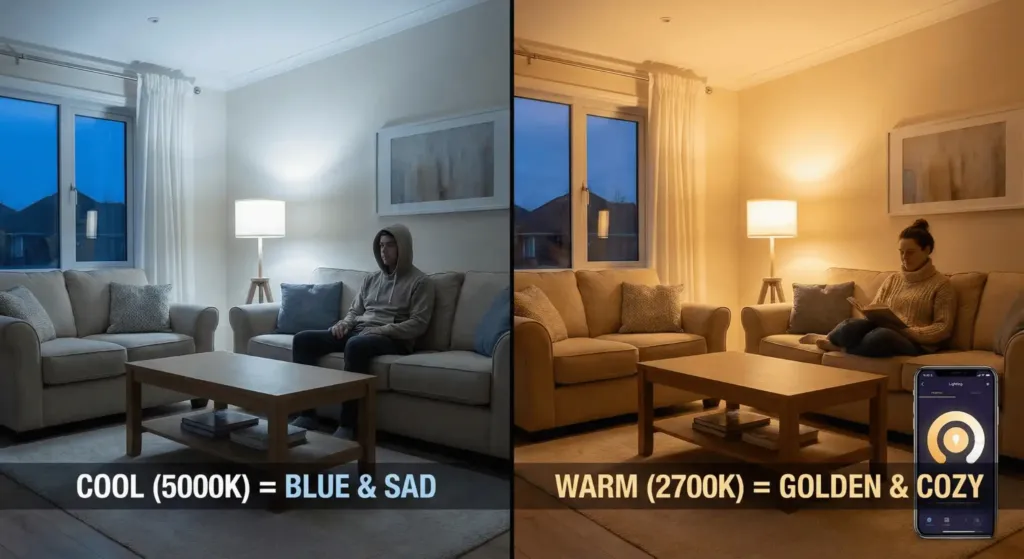
Lighting is the most overlooked part of design. Cool bulbs (5000K) make neutral rooms look blue and sad. Warm bulbs (2700K) make them look golden and cozy.
I replaced every bulb in my house with Philips Hue bulbs. They are expensive (about 40 dollars each). But I can change the warmth from my phone. If you want a cheaper option, just look for “Warm White” on the box. Never use “Daylight” bulbs in a living room. It kills the mood.
18. Mix matte and gloss finishes
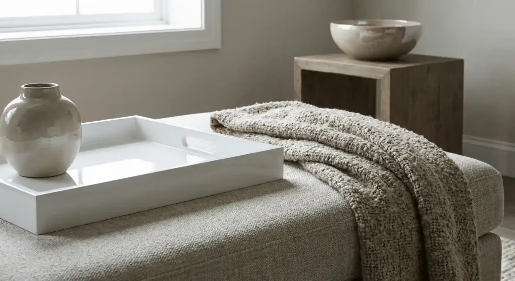
If everything is matte, the room looks dry. If everything is gloss, it looks plastic. You need both. Put a high-gloss ceramic bowl on a matte wood table.
I have a lacquered white tray on my ottoman. It reflects the light from the window. Next to it, I have a rough wool throw blanket. That contrast is what makes a room feel “professional.” It is a free way to upgrade your styling. Just look around your house and swap items.
19. Add a pop of charcoal or slate
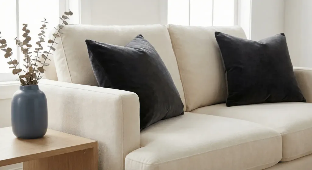
A “near-black” neutral adds depth. Use it in small doses. A charcoal pillow or a slate blue vase. It makes the lighter neutrals look even brighter.
I used charcoal velvet pillows on my cream sofa. They cost 20 dollars each at H&M. They provide a “stop” for the eye. Without them, the sofa looked like a giant blob. Dark colors provide the necessary contrast to make light colors pop.
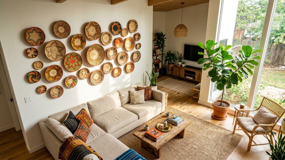
20. Incorporate woven baskets
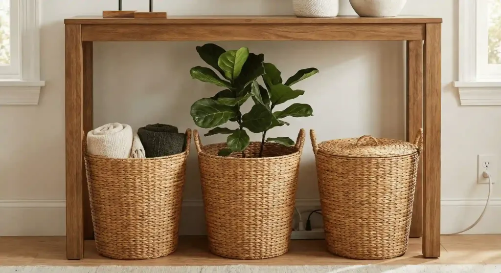
Baskets are the best tool for organization. They also add a honey-colored wood tone. Use them for blankets, toys, or even large plants.
I buy sea-grass baskets from World Market. They are about 30 dollars. I tuck them under my console table. They hide the messy wires and add a natural texture. Baskets are a “triple threat.” They are cheap, look good, and help you clean up.
21. Use slipcovered furniture for a relaxed vibe
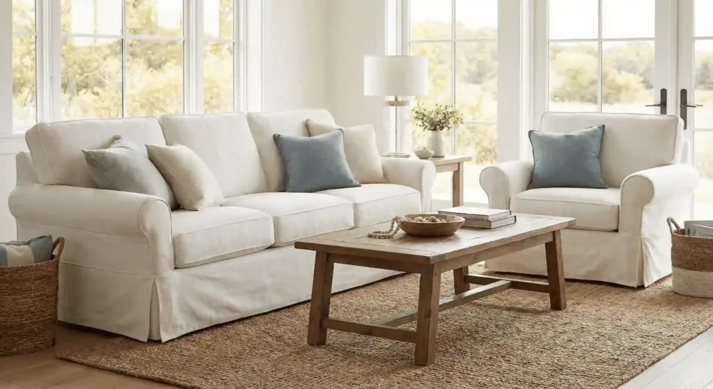
Slipcovers allow you to have white furniture without the stress. You can take them off and wash them. They give a “coastal” or “farmhouse” feel that is very inviting.
I have a slipcovered chair from IKEA (the Ektorp/Uppland). I have washed the cover ten times. It still looks new. It makes the room feel less formal. People feel like they can actually sit down and relax. A high-end version would be the Sixpenny sofas, which cost about 4,000 dollars.
22. Style with a stack of neutral books
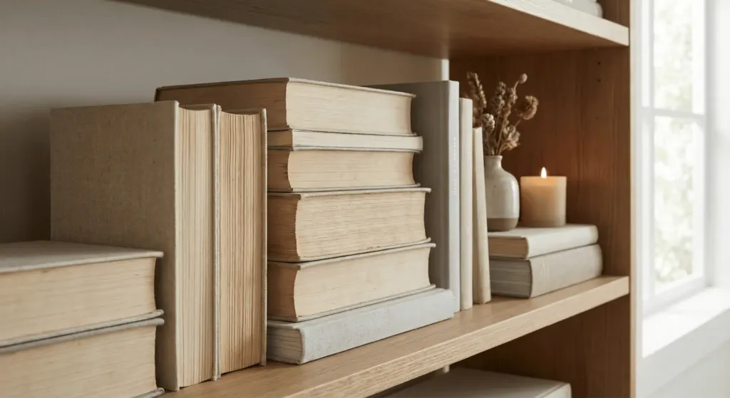
Books are great for decor. If your book covers are too bright, turn them around. The “page side” out creates a beautiful cream texture on your shelves.
I did this on my main bookshelf. I didn’t buy new books. I just flipped the ones I had. It took 10 minutes and cost zero dollars. It instantly calmed the room down. If you want a more “pro” look, buy vintage linen-bound books from eBay. You can buy them “by the foot” for about 20 dollars.
How much does a neutral living room refresh cost?
| Item | Budget Option | High-End Option |
| Paint (per room) | $100 (DIY) | $1,500 (Pro) |
| Area Rug (8×10) | $200 (Jute) | $2,500 (Wool/Silk) |
| Sofa | $800 (IKEA) | $5,000+ (Custom) |
| Lighting | $50 (Target) | $800 (Designer) |
| Curtains | $60 (H&M) | $1,200 (Custom Linen) |
A full refresh usually costs between 1,000 and 10,000 dollars. It depends on if you buy new furniture or just paint and accessories. I suggest spending the most on your sofa and rug. You can go cheap on tables and art.
Frequently Asked Questions
How do I stop a beige room from looking boring?
You must use texture. A beige room with flat walls and a flat sofa is boring. A beige room with a jute rug, a bouclé chair, and a wood table is interesting. Texture is the “secret sauce” of neutral design.
What is the best white paint for a living room?
I recommend Sherwin-Williams Alabaster. It is a warm white that does not look yellow. It works in almost every light. Another great pick is Benjamin Moore White Dove. It has a tiny bit of gray to keep it soft.
Can I have a neutral room with kids and pets?
Yes. Use performance fabrics. Look for “Crypton” or “Performance Velvet.” Buy rugs made of synthetic fibers or wool. Avoid “Viscose” rugs. They stain if you drop a single drop of water on them.
Should my trim match my walls?
Painting the trim the same color as the walls is very popular now. It is called “color drenching.” Use a satin finish on the trim and a flat finish on the walls. It makes the room look bigger and more modern.
Is gray still in style?
Cool grays are fading. Warm grays, often called “Greige,” are still very popular. Think of colors like Benjamin Moore Revere Pewter. They feel more like a hug and less like an office.
Final Steps for Your Space
Neutral design is about how a room feels. It is not just about how it looks. Start with your largest piece of furniture. Build layers from there. Don’t be afraid to mix old and new. My favorite rooms are the ones that tell a story.
I want to hear from you. What is your biggest struggle with neutral colors? Are you afraid of white sofas? Leave a comment below. I answer every single one. If you found this helpful, share it with a friend who is moving. [Internal Link: 10 more design secrets for small homes].