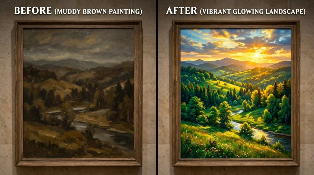
You stand in the art aisle. Your cart holds three tubes. Red. Blue. Yellow. The label says these are the “building blocks of everything,” yet your last attempt at mixing a sunset looked like wet pavement. I have been there. In 2018, I spent $400 on professional-grade acrylics only to produce a muddy mess because I didn’t understand that not all yellows are created equal. This is the definitive guide to the Yellow Palette and how to force those three stubborn colors to play nice.
Why Your Yellow Color Combinations Look Like Mud
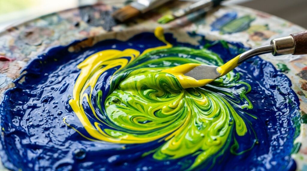
Most people think yellow is the “friendly” color. It isn’t. Yellow is the most fragile pigment in your kit. If you drop a microscopic bead of blue into a Yellow Aesthetic base, you don’t get a beautiful lime. You get a sickly, bruised olive.
I remember my first “color theory” disaster. I was trying to paint a bright sunflower for a client in Portland. I mixed a standard CAD Yellow with a cheap Ultramarine Blue. The result was a dull, swampy green that lacked any life. Why? Because I ignored the “bias” of the paint. Every Color Palette Yellow has a secret lean toward either red or blue.
If your Yellow Palette contains a “Warm Yellow” (leaning red), and you mix it with blue to make green, you are technically mixing red, blue, and yellow. That is a recipe for brown. To get that neon-sharp green, you need a “Cool Yellow” (leaning blue). This is the “Aha!” moment most beginners miss for years.
Breaking the Red Colour Palette Myth
We are taught that red is the king of the canvas. It screams. It demands attention. But in a primary-only setup, red is actually your greatest liability. Use too much, and it swallows your Aesthetic Colors whole.
I once worked on a mural project where we only had primary buckets. We tried to make a soft peach for a skin tone. We added one teaspoon of red to a gallon of white and yellow. The entire gallon turned a deep, aggressive bubblegum pink instantly.
The Red Colour Palette is about restraint. When you mix red with blue to get purple, you realize quickly that blue is heavy and red is loud. Finding the balance requires a “drop-by-drop” approach that most people are too impatient to follow. If you want a royal purple, you must start with the blue and slowly introduce the red. Reversing this order wastes half your paint.
Navigating the Blue Colour Palette Depths
Blue is the anchor. It provides the shadows and the structural integrity of your work. However, the Blue Colour Palette can be cold and uninviting if you don’t use the Yellow Palette to breathe life into it.
In my early days as a designer, I leaned too hard into “Cool Blue” for brand identities. The feedback was always the same: “It feels like a hospital.” I started experimenting with adding a 2% Yellow Aesthetic tint to my blues. Suddenly, the designs felt “organic” and “approachable.”
Blue isn’t just one thing. You have Phthalo Blue, which is a transparent monster that stains everything it touches, and Cerulean, which is soft and chalky. When you understand these personalities, your Learning Colors journey shifts from frustration to mastery.
The Science of Aesthetic Colors in the Real World
Why do we find certain combinations pleasing? It isn’t just luck. It is physics. When you look at a Color Palette Yellow next to a deep violet, your eye experiences “simultaneous contrast.” The yellow looks brighter, and the violet looks deeper.
I use this trick in every project. If a client wants a “bright” room but hates bright paint, I paint the accents in a muted complementary color. The human brain does the work for us.
This is why Classroom Posters always look so vibrant. They use high-contrast primary pairings. They don’t mess with subtle pastels because children’s eyes respond best to the high-frequency vibration of pure primary hues. If you want your home or your art to pop, stop looking for “new” colors and start looking at how your primaries sit next to each other.
12 Specific Yellow Palette Strategies for Professionals
Here is the raw data on how to handle the most difficult color in your arsenal.
1. The Glazing Technique
Never mix white into your yellow if you want it to glow. Use a transparent yellow over a white base. This allows light to hit the white and bounce back through the pigment.
2. The Neutralizing Secret
To make a “Natural Yellow” for landscapes, don’t use black. Use a tiny speck of purple. This kills the “plastic” look of the paint without making it look dirty.
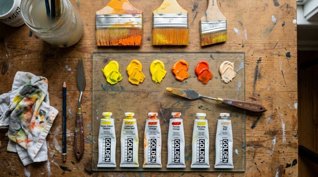
3. Temperature Zoning
Keep your “Cool Yellows” (Lemon) and “Warm Yellows” (Deep Gold) in separate zones of your palette to avoid accidental contamination.
4. High-Key Highlights
Use a Yellow Aesthetic for highlights instead of pure white. It creates a “sun-drenched” feel that white simply cannot replicate.
5. The Underpainting Rule
Always start with a red or orange underpainting if you plan to layer yellow on top. It adds a “soul” to the final color that makes it feel three-dimensional.
6. Managing Opacity
Most yellows are transparent. If you need a solid coat, you must mix in a tiny bit of Titanium White or a heavy-body ochre first.
7. Digital vs. Physical
Remember that #FFFF00 on a screen is light. Yellow paint is a chemical. They do not behave the same way in shadows.
8. Skin Tone Foundations
Every human skin tone contains yellow. If your portraits look “dead,” it is likely because you left out the Yellow Palette mid-tones.
9. Contrast Ratios
Yellow is the lightest value on the wheel. It needs a dark neighbor to be seen. Pair it with dark blues or deep reds for maximum impact.
10. The “Dirty Water” Trap
Yellow is the first victim of dirty rinse water. Change your water every 15 minutes when working with a Yellow Aesthetic.
11. Lighting Conditions
Yellow shifts drastically under LED vs. Incandescent light. Always check your Color Palette Yellow under the final intended light source.
12. Emotional Weight
Yellow is “anxious” in large quantities. Balance it with grounding blues to prevent “viewer fatigue.”
Tools I Actually Use (and Some I Hate)
I have tested dozens of brands. Here is the honest truth.
- Golden Heavy Body Acrylics: The gold standard for Yellow Palette consistency. It stays wet longer and doesn’t “shift” when drying.
- Liquitex Basics: Great for Classroom Posters, but the yellow is too transparent for professional work. It feels like jelly.
- Old Holland Oils: Their Red Colour Palette is unmatched. It is expensive, but one tube lasts three years because the pigment is so dense.
- Adobe Color: My go-to for testing Aesthetic Colors before I touch a brush. It’s free and saves hours of mixing mistakes.
- Pantone Guides: Essential for print, but useless for fine art. Don’t waste $200 on these unless you are a commercial graphic designer.
Case Study: The “Sunlight” Failure
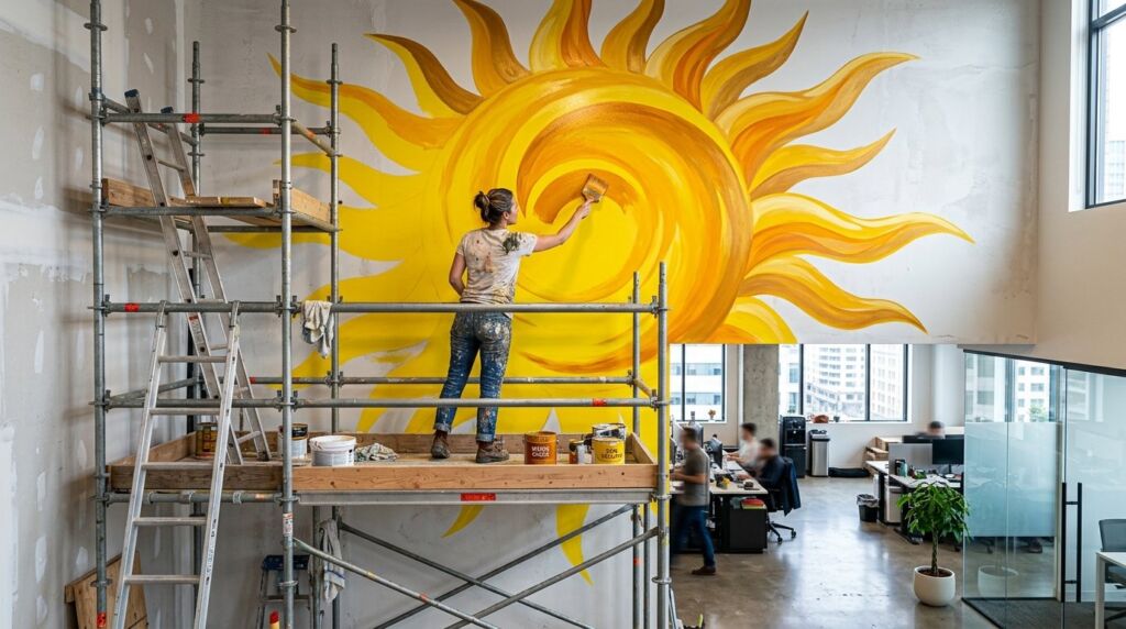
In 2021, I was commissioned to paint a 10-foot sun for a tech office. I thought I could just buy “Bright Yellow” and be done. I was wrong. Under the office’s cool fluorescent lights, the yellow looked greenish and sickly.
I had to go back and glaze the entire piece with a warm Red Colour Palette wash (specifically Quinacridone Magenta diluted 90%). That tiny hint of red corrected the blue-bias of the overhead lights.
The Outcome: The client was thrilled, and I learned that environment dictates color more than the paint itself.
Frequently Asked Questions
Why does my yellow look green when I add black?
Black paint often has a blue base. When you mix “Blue-Black” with yellow, you are making green. To darken yellow without turning it green, use a Burnt Sienna or a deep purple instead.
What are the best Aesthetic Colors to pair with yellow?
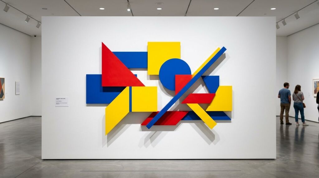
For a modern look, pair a Yellow Palette with charcoal grey and a dusty Blue Colour Palette. For something high-energy, go with a primary triad: Red, Blue, and Yellow, but vary the “amounts” (e.g., 70% Yellow, 20% Blue, 10% Red).
How do I teach Learning Colors to children?
Use transparent overlays. Give them pieces of red, blue, and yellow cellophane. Letting them see the colors change as they stack the sheets is much more effective than messy paint for the first lesson.
Conclusion: The Primary Truth
Mastering the Yellow Palette is a lifelong journey of observation. It isn’t about following a recipe; it is about understanding how colors fight and flirt with each other on the surface. Stop buying 50 different tubes of paint. Go back to the primaries. If you can’t make 1,000 colors from Red, Blue, and Yellow, you aren’t an artist yet—you’re just a consumer.