Last Tuesday I walked into a client home where the walls were a muddy beige and the energy felt completely drained. The homeowner spent four thousand dollars on furniture that just sat there looking heavy and uninspired. We decided to strip away the dull neutrals and bring in a palette of cool waters and forest depths. By the time we finished on Friday afternoon the space felt like a high-end coastal retreat without buying a single new sofa. You can achieve this same high-impact change by focusing on the tension between cool azure and organic emerald. Most people fail because they use equal amounts of both colors which creates a chaotic visual vibration. In my experience the secret lies in choosing one dominant shade and using the other as a sharp punctuation mark.
Executive Summary
You will see exactly how to balance these two powerful cool tones to create a space that feels both calm and energizing. This guide covers twenty-one specific design moves that work for small apartments and large open-plan homes alike. I will preview how to use Sherwin Williams paint colors to anchor your room and which trending sofa designs actually provide the best return on your investment. We will examine how to transition your space for the fall season and even how to handle tricky holidays like Halloween without losing your aesthetic. This article intentionally excludes structural renovations or high-cost lighting installations. Instead we focus on styling and color theory that you can implement this weekend. You will discover how to save hundreds of dollars by repurposing items you already own while adding just a few strategic navy or sage accents.
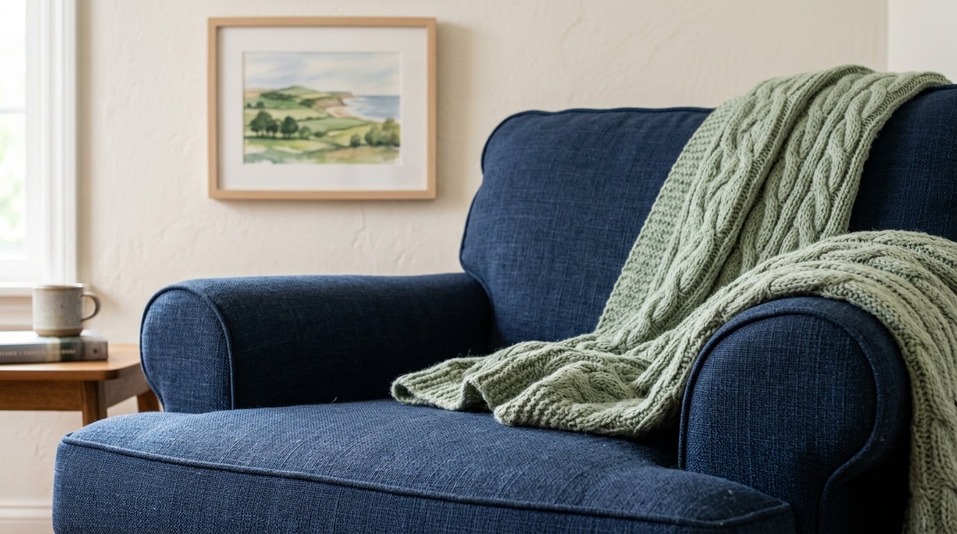
You can create immediate depth by placing dark navy pillows against a light sage green chair. I once saw a living room where this simple swap made a three hundred dollar chair look like a two thousand dollar designer piece. Try searching for velvet textures to catch the light in different ways throughout the day. This project takes about ten minutes and costs under fifty dollars if you buy covers instead of full pillows. A common mistake is using cotton fabrics which can look flat and cheap in these specific moody tones.
2. Velvet Emerald Seating
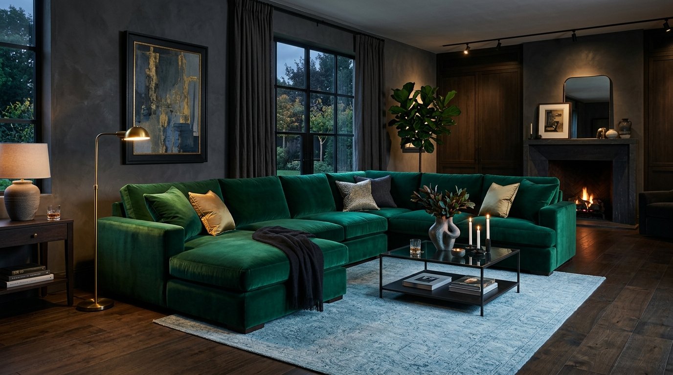
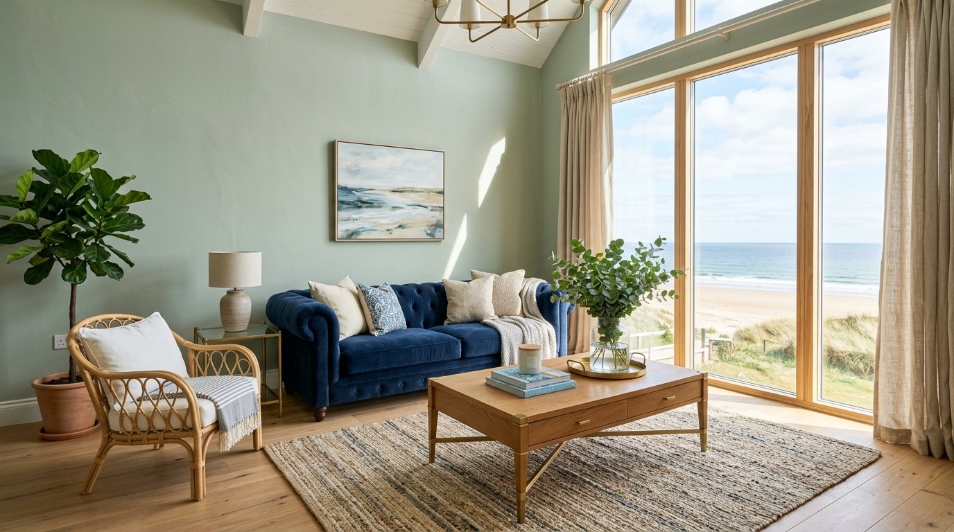
An emerald green sofa serves as a heavy anchor for a room filled with lighter blue walls. I recently worked with a family who chose a deep forest velvet for their main sectional and it hid every spill from their toddlers perfectly. You should look for performance velvet options from brands like Article or West Elm to ensure durability. This is a larger investment of roughly twelve hundred dollars but it defines the entire room. Avoid choosing a neon green shade as it will quickly feel dated and hard to style during seasonal changes.
3. Coastal Sky Textiles
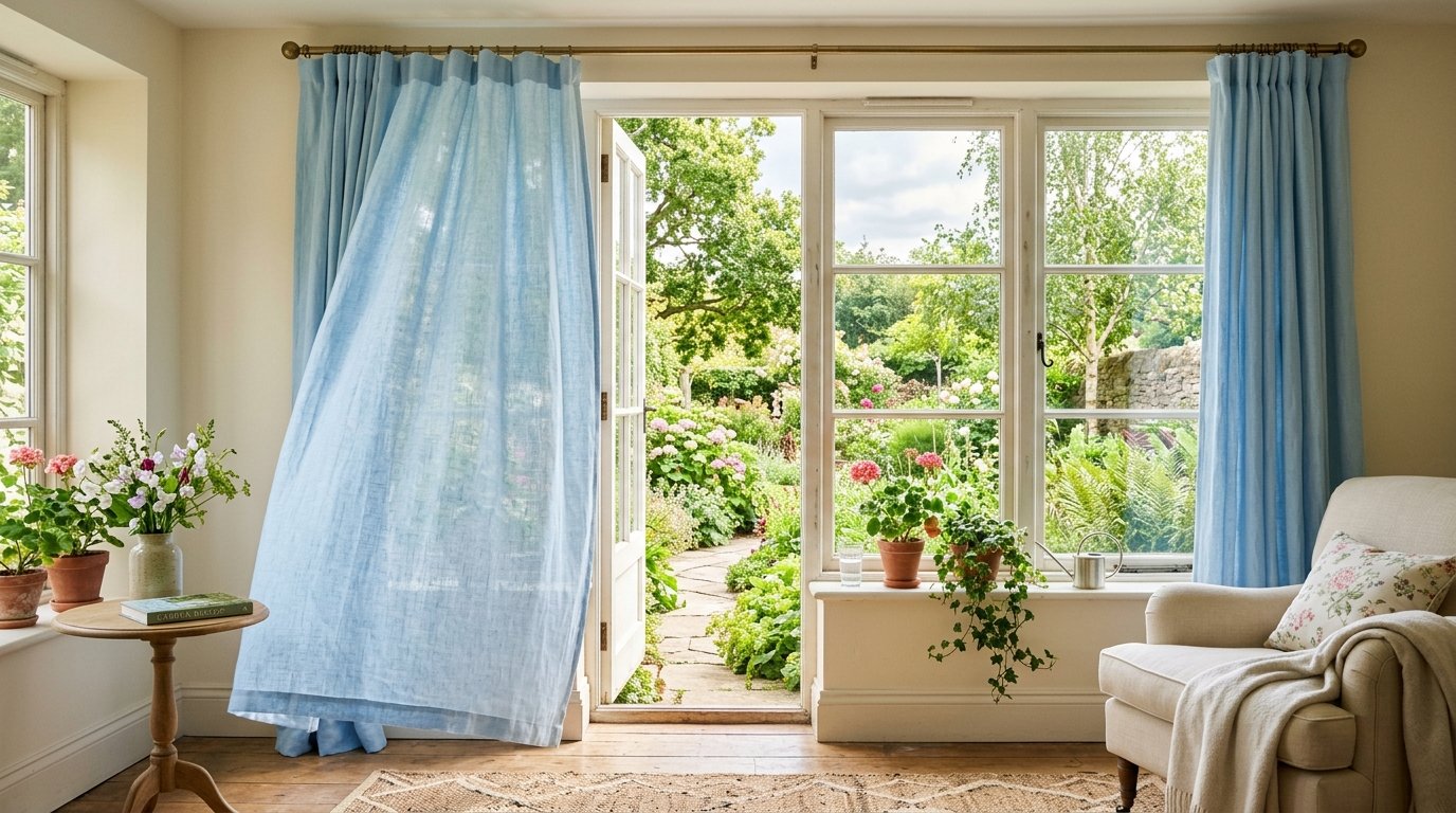
Soft sky blue curtains allow natural light to filter through while still providing a sense of color. I have noticed that linen blends work best for this because they offer a relaxed and breathable feel. You can hang these in less than an hour for about eighty dollars per window. Ensure you mount the rod several inches above the frame to make your ceilings appear much taller. Many people buy curtains that are too short which makes the room feel small and choppy.
4. Painted Accent Walls
A single wall in a shade like Sherwin Williams Sea Salt creates a backdrop that makes green plants pop. I tried this in a small den last year and the room instantly felt five feet wider. You only need one gallon of paint and a Saturday afternoon to complete this. The total cost usually stays under seventy dollars including the rollers and tape. Do not paint every wall this color or the room might feel like a hospital ward rather than a cozy sanctuary.
5. Botanical Patterned Pillows
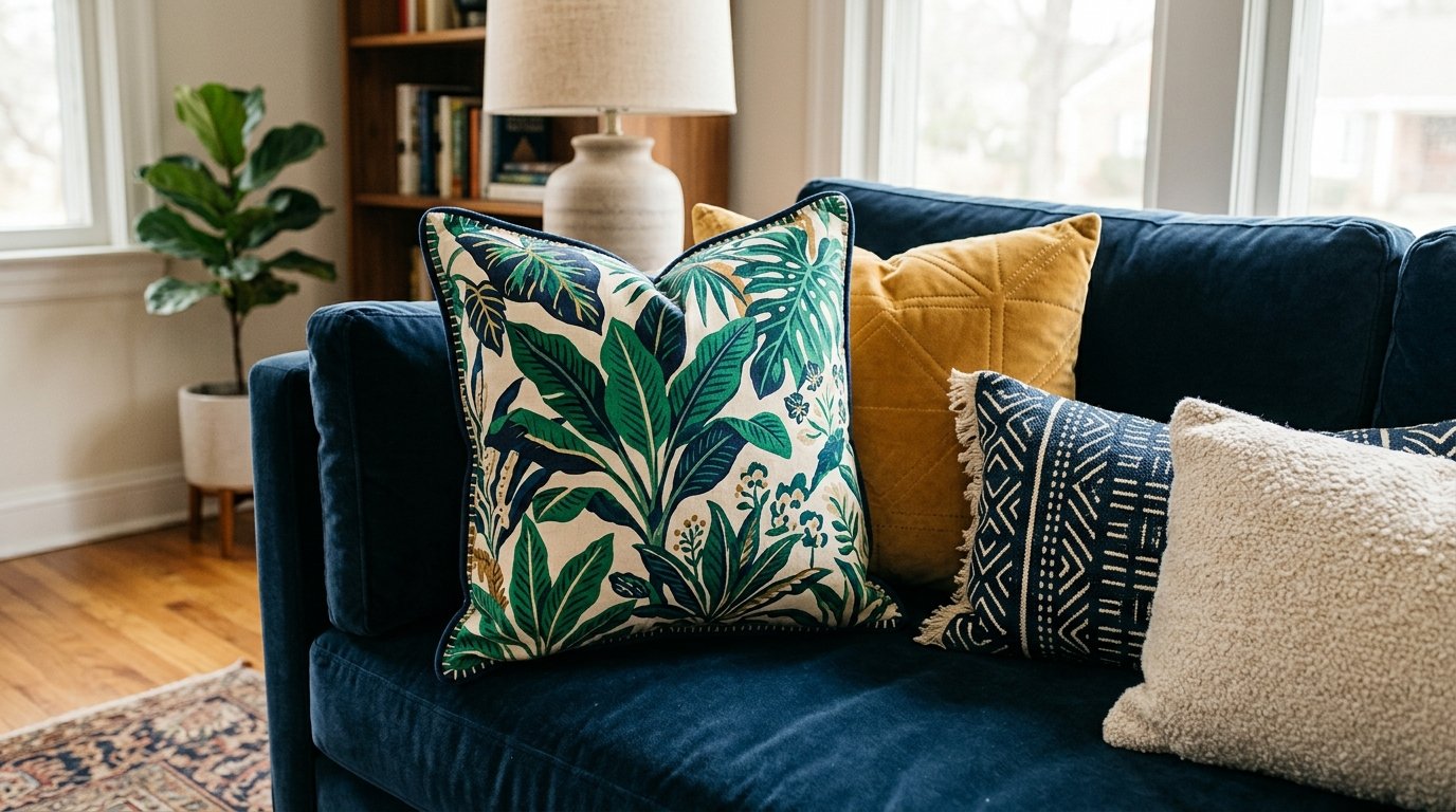
Integrating patterns that feature both colors helps bridge the gap between your blue and green elements. I’ve seen many people struggle to make their furniture match until they added a leafy print that contained both navy and lime. You can find these at shops like Etsy for twenty dollars each. Look for hand-blocked prints to add a touch of artisanal quality to your sofa. Avoid tiny repetitive patterns that can look busy and distracting from across the room.
6. Teal Area Rugs
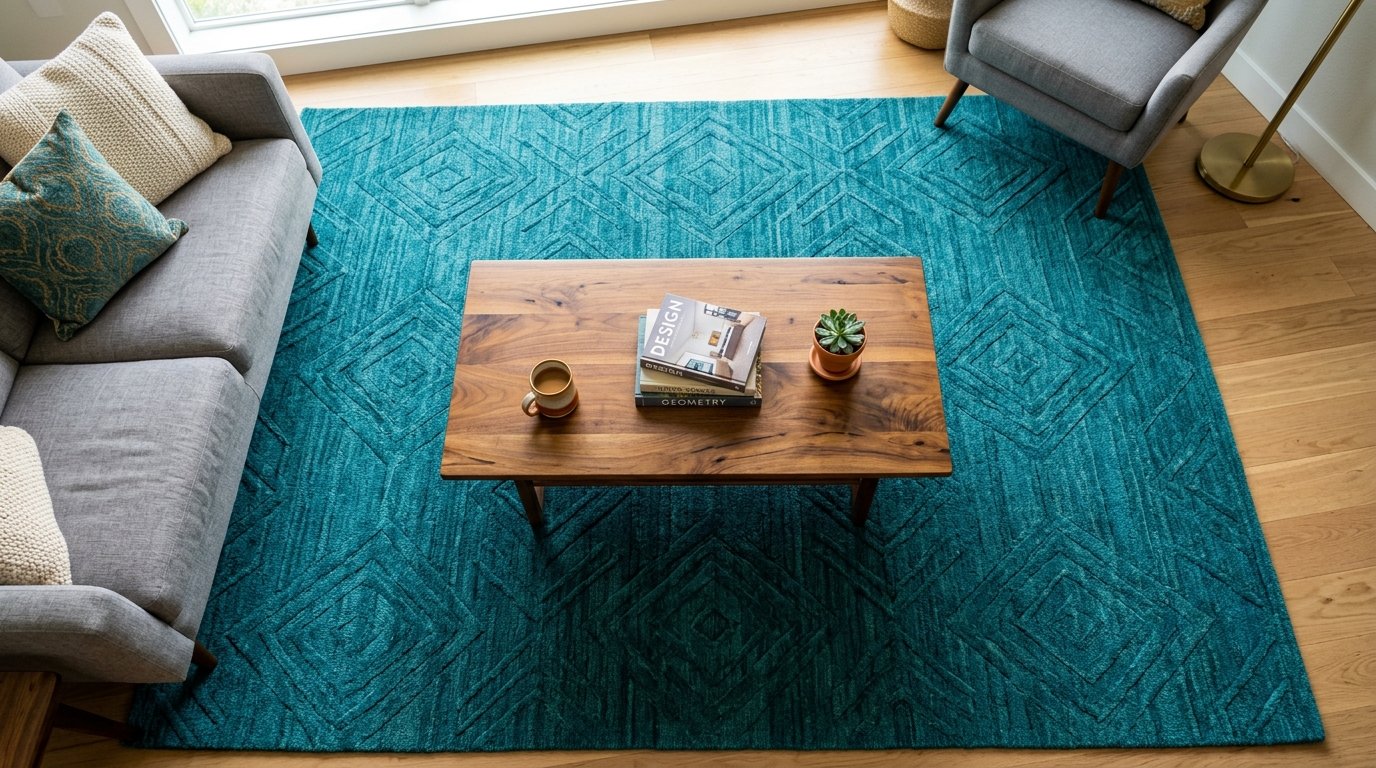
A large teal rug pulls together different shades of blue and green from around the space. In my observation a low-pile rug works best for high-traffic areas because it is much easier to clean. You can find high-quality eight-by-ten rugs for around two hundred dollars online. Aim for a rug that has a slight distressed finish to give the room an established feel. Do not get a rug that is too small for your furniture as it makes the room look disjointed.
7. Natural Wood Textures
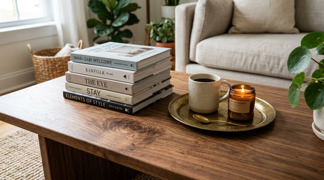
Adding warm wood tones prevents a blue and green room from feeling too cold or sterile. I often recommend oak or walnut coffee tables to ground the ethereal cool colors. This adds a physical weight to the design that feels very comforting. You can pick up a vintage wood table at a thrift store for fifty dollars and refinish it yourself. A common error is using gray-toned wood which can make the space feel muddy and gloomy.
8. Brass Hardware Details
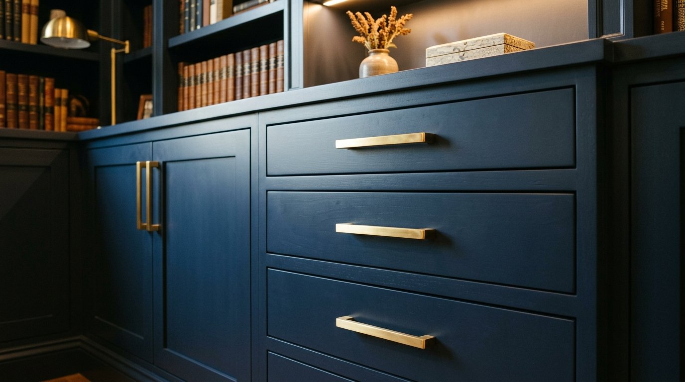
Gold or brass accents shine beautifully against deep navy and forest green. I noticed that swapping out boring silver knobs for brass versions completely changed the look of a built-in cabinet. This task takes thirty minutes and costs about five dollars per knob. The warmth of the metal acts as a perfect contrast to the cool primary palette. Avoid using brushed nickel in these rooms as it often disappears against the blue tones.
9. Layered Window Treatments
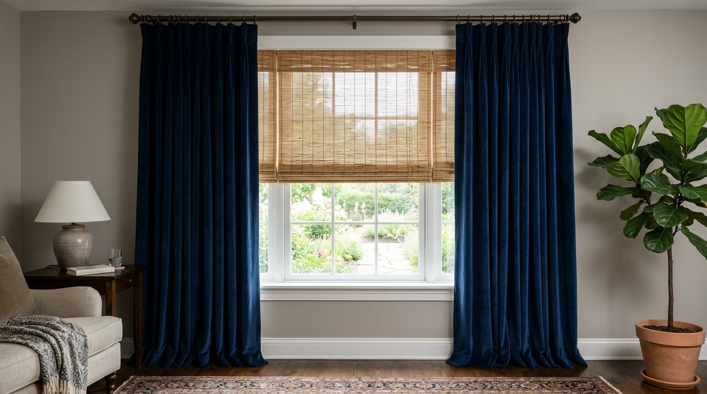
Combine a bamboo shade with blue velvet drapes for a sophisticated and textured look. This combination provides excellent light control and privacy for your main living area. I have used this setup in dozens of homes to add a professional layered feel. Expect to spend about one hundred fifty dollars per window for the full set. Do not skip the shades because bare windows can make a colorful room feel unfinished and exposed.
10. Ceramic Table Lamps
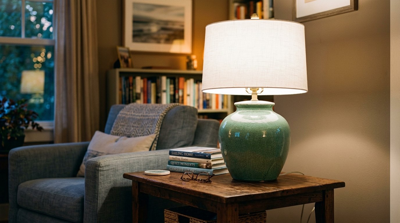
Large ceramic lamps in a crackled green glaze add a sculptural element to your end tables. I found that a pair of statement lamps can replace the need for expensive wall art. You can find great options at HomeGoods for forty dollars each. Make sure the shades are a crisp white to keep the colors looking clean. Avoid lamps that are too small or they will look like an afterthought on your furniture.
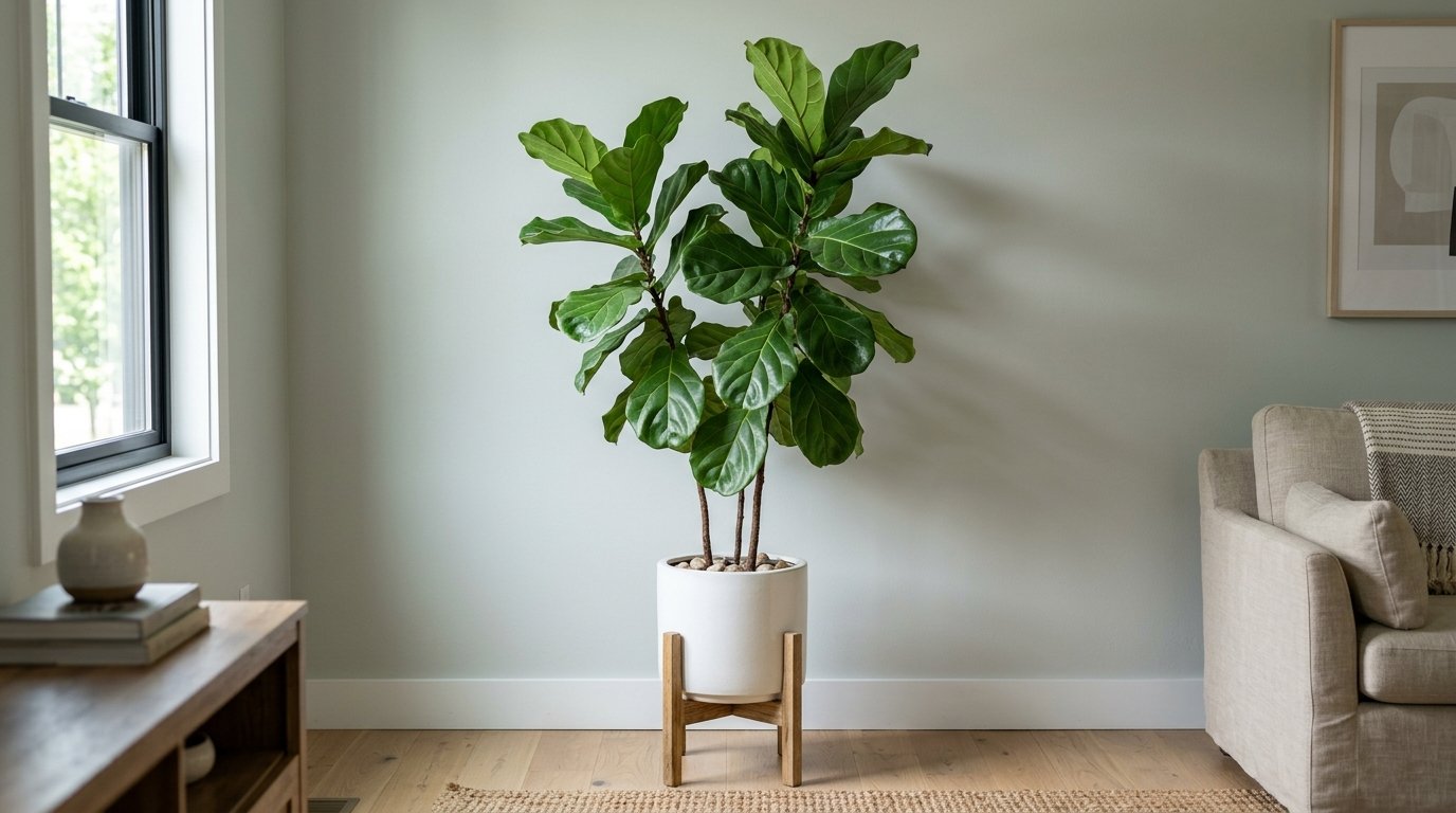
11. Oversized Leafy Greenery
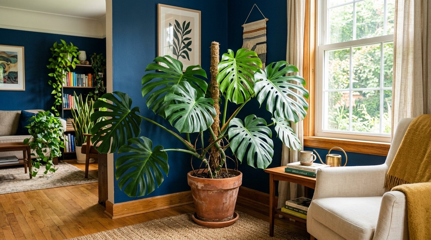
Nothing beats the real thing when it comes to bringing green into a living space. A large Fiddle Leaf Fig or a Monstera provides a natural texture that artificial items cannot replicate. I noticed that placing a large plant in a corner can hide ugly cords or outlets. You can buy a mature plant for sixty dollars at most local nurseries. A common mistake is buying a tiny plant for a large room where it will look lost and insignificant.
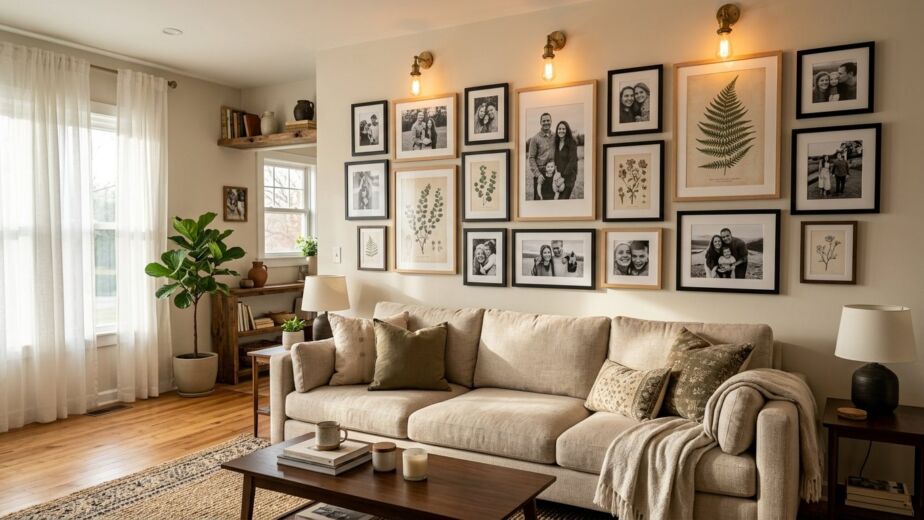
12. Framed Moody Landscapes
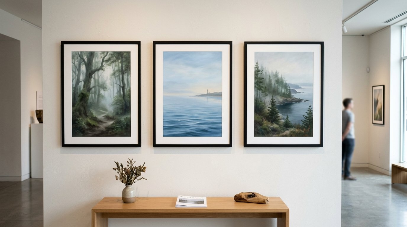
Art featuring misty forests or rolling oceans reinforces your color scheme through a literal lens. I once helped a client frame three thrifted landscape prints and it became the focal point of their home. This costs about one hundred dollars if you use affordable frames from a craft store. Look for art that has a bit of white space to keep the wall from feeling too heavy. Do not hang your art too high as it should be at eye level for the best impact.
13. Woven Rattan Furniture
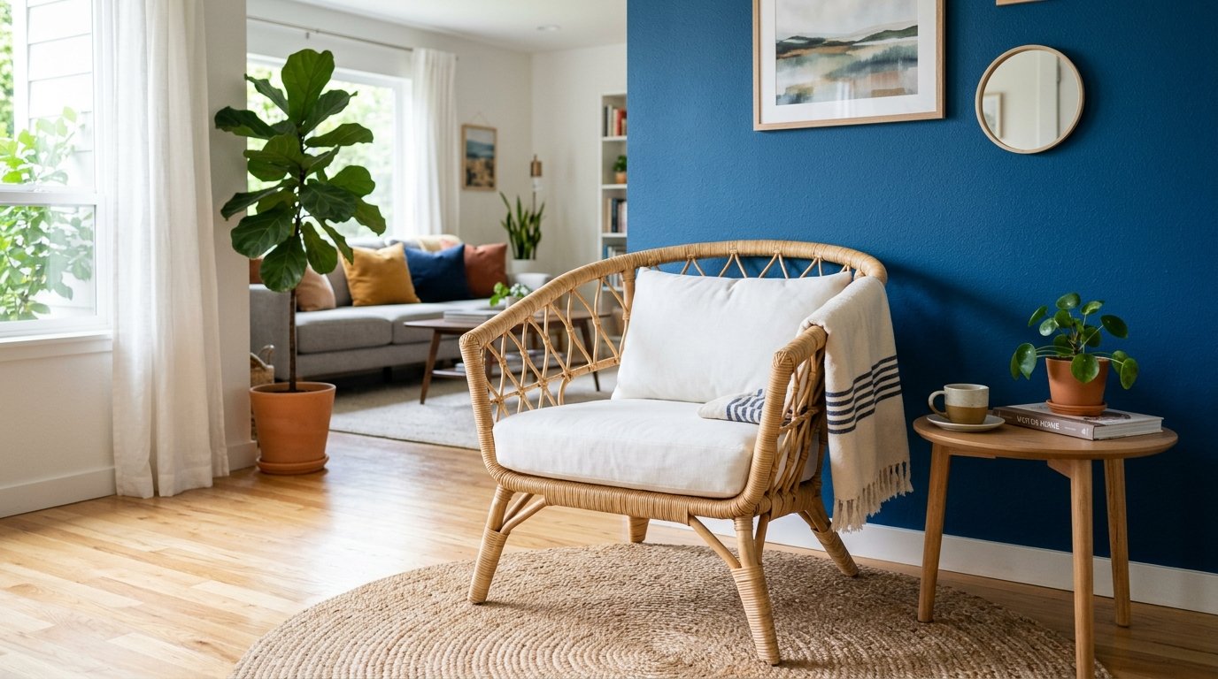
Rattan chairs or side tables bring an organic green-adjacent texture to your layout. I love how the honey tones of rattan play off the coolness of a navy blue living room. You can find a stylish accent chair for under two hundred dollars at many retailers. It adds a casual and approachable vibe to an otherwise formal space. Avoid overusing rattan or the room might start to look like a sunroom instead of a living room.
14. Soft Mint Throws
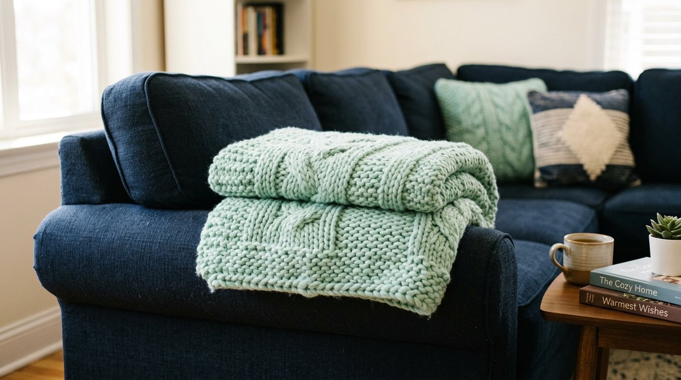
A mint green blanket draped over a dark sofa lightens the visual load of the furniture. I have tried this in my own home and it makes the seating area feel much more inviting. You can grab a high-quality knit throw for thirty dollars. It is an easy way to change the mood of the room as the seasons shift. Do not use neon or bright mint as it can look like it belongs in a nursery rather than a grown-up space.
15. Geometric Wall Art
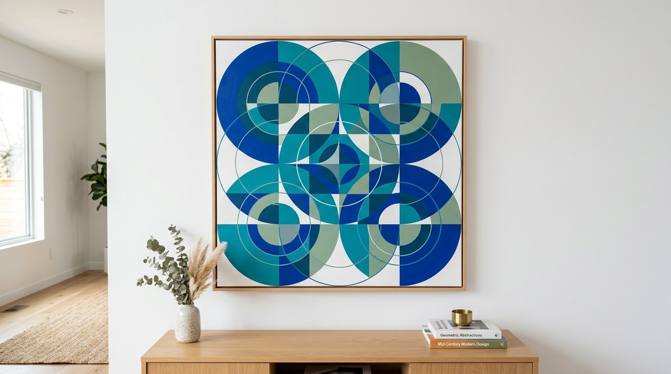
Clean lines and shapes in blue and green hues add a modern touch to your decor. I’ve seen this work exceptionally well in minimalist homes that need a splash of personality. You can even create your own canvas art using leftover wall paint for almost no cost. This provides a custom look that matches your specific shades perfectly. Avoid using too many different shapes or the wall will start to feel cluttered and messy.
16. Glass Vase Collections
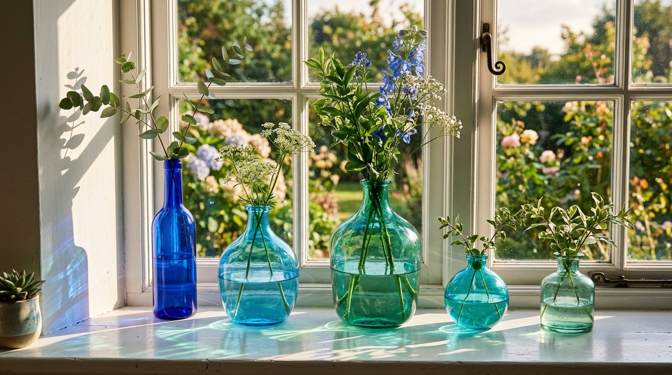
Grouping several glass vases in varying shades of seafoam and cobalt creates a beautiful light-catching display. I often place these on a mantel or a windowsill where the sun can shine through them. You can collect these from antique shops for five to ten dollars a piece. It is a low-cost way to add a lot of visual interest to a flat surface. Do not line them up in a perfectly straight row or they will look too stiff and formal.
17. Dark Forest Built-ins
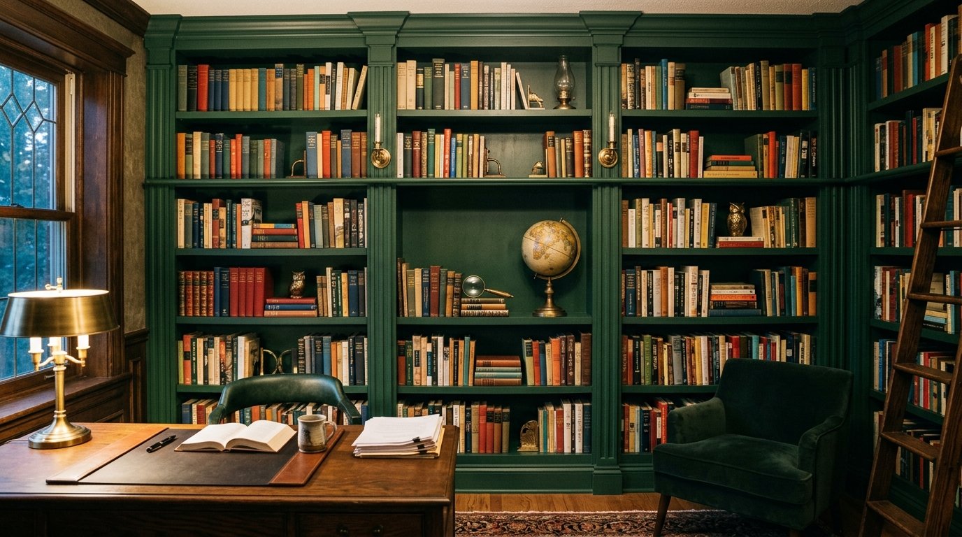
Painting your bookshelves a deep forest green creates a dramatic backdrop for your book collection. I noticed that dark shelves actually make the colorful spines of books stand out more clearly. This requires about two days of work and two gallons of high-quality cabinet paint. Budget around one hundred dollars for the materials. Avoid using flat paint for this as it will show every fingerprint and scuff mark.
18. Linen Slipcovered Sofas
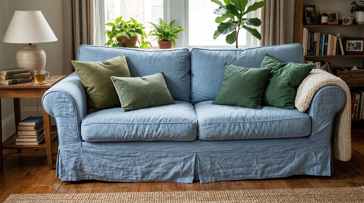
A pale blue linen slipcover gives your sofa a fresh and breezy look that is also practical. I have recommended these to pet owners because they can be tossed in the wash whenever they get dirty. You can find custom covers for around three hundred dollars depending on your sofa model. It is much cheaper than buying a whole new piece of furniture. Do not choose a fabric that is too thin or it will look wrinkled and sloppy very quickly.
19. Statement Floral Centerpieces
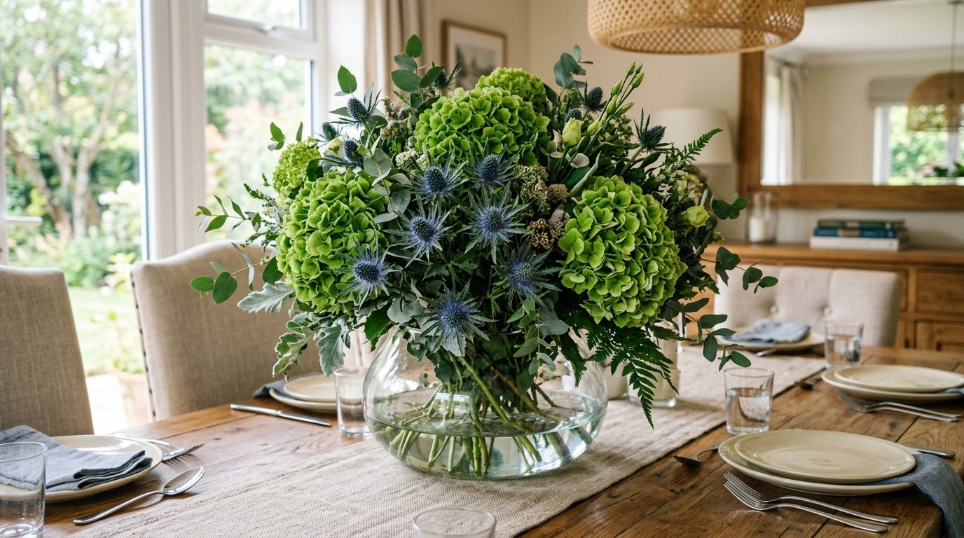
Using green hydrangeas or blue thistles in a large bowl creates a seasonal focal point. I’ve noticed that fresh flowers can lift the mood of a room faster than any permanent decor item. This costs about twenty dollars at the grocery store and lasts for a week. It is perfect for when you are hosting guests or just want a midweek pick-up. A common error is using fake flowers that have a plastic sheen which can look very cheap.
20. Two-Tone Coffee Tables
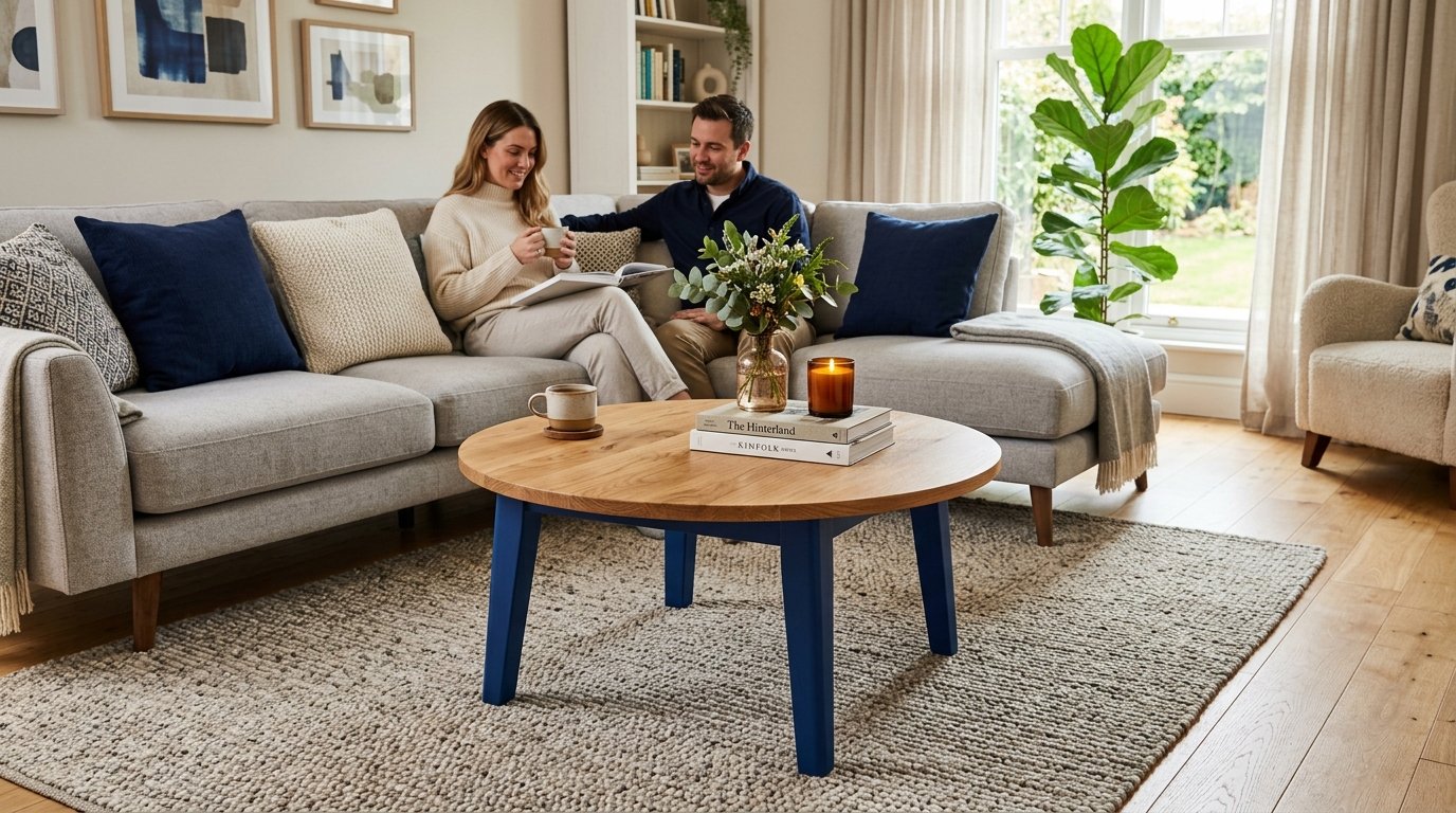
A table with a wood top and painted blue legs adds a playful touch to your seating area. I recently helped a friend upcycle an old coffee table this way and it became her favorite piece. You only need a small sample pot of paint and a brush to do this for under fifteen dollars. It breaks up the monotony of all-wood furniture in a room. Avoid using high-gloss paint as it can make the furniture look like plastic.
21. Seasonal Mantle Displays
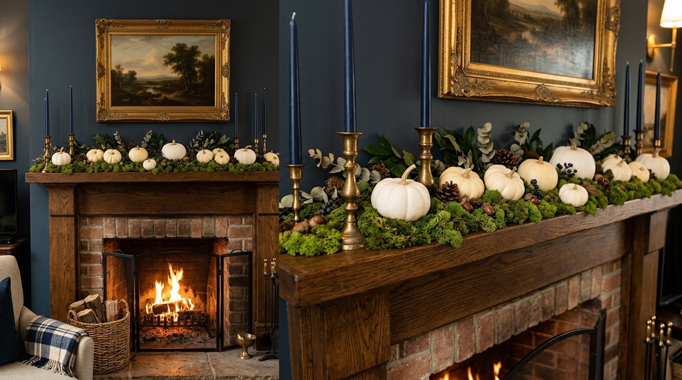
Transition your mantel using green moss and blue candles to match the current time of year. I love using fall room decor like white pumpkins nestled in green vines during the autumn months. This takes about twenty minutes to style and can be done with items found in your backyard. It keeps your living room feeling current and well-tended. Do not overfill the mantel or it will start to look like a shelf of clutter instead of a curated display.
Frequently Asked Questions
What are the best Sherwin Williams paint colors for this look?
In my experience Sherwin Williams has some of the most reliable tones for a cool-toned palette. For a subtle green that acts as a neutral I always suggest Sea Salt because it changes beautifully with the light. If you want a deep navy to anchor the room Naval is a classic choice that doesn’t look too purple. For a more modern forest feel try Evergreen Fog which was a color of the year for a reason. These shades provide a sophisticated backdrop that allows your furniture to shine without being overwhelming.
How do I style a blue and green living room for Halloween?
Halloween room decor doesn’t have to be orange and black which can clash with your cool palette. I’ve noticed that using white pumpkins and black crows looks incredible against a navy blue wall. You can also use “poison” bottles in green glass to lean into a spooky apothecary vibe. This keeps the holiday spirit alive while respecting the design work you have already done. Avoid the cheap orange tinsel or plastic pumpkins as they will break the sophisticated flow of your space.
Which trending sofa designs work best with these colors?
Currently I am seeing a lot of curved silhouettes and low-profile modular designs in deep jewel tones. A curved sofa in emerald green adds a soft organic feel to a room with many straight lines. If you prefer a more traditional look a tuxedo-style sofa in a navy linen is a timeless option. These shapes highlight the richness of the colors and provide a high-end feel. Look for fabrics with a bit of texture like boucle or velvet to add another layer of interest.
Can I include fall room decor without using orange?
Absolutely and I actually prefer it for a more curated look. You can use dried eucalyptus branches and deep green velvet pumpkins to signal the shift in seasons. I’ve tried using amber glass accents which provide a hint of warmth without the jarring contrast of bright orange. This creates a cozy fall mantle decor setup that feels intentional and upscale. Use textures like chunky wool knits in cream or sage to add the warmth needed for cooler months.
How do I prevent the room from feeling too dark?
If you are using deep shades like navy or forest green you must balance them with plenty of white or cream. I always suggest using a crisp white for the ceiling and trim to provide a visual break. Adding mirrors on the walls opposite your windows will also help bounce more natural light around the space. You should also ensure you have multiple light sources including floor lamps and task lighting. Avoid using dark heavy rugs if your walls are already a deep shade.
Is blue and green a good choice for a small room?
Yes it can actually help the walls recede and make the space feel larger if you use the right shades. Light sky blues and pale mints are excellent for reflecting light and creating an airy feel. I’ve noticed that painting the baseboards the same color as the walls can also make the ceilings feel higher. You should avoid heavy dark furniture and stick to pieces with legs to show more of the floor. This creates a sense of openness even in a tight footprint.
I find that medium-toned woods like walnut or cherry provide the perfect amount of warmth. They have enough red or yellow undertone to balance out the cool blues and greens without looking out of place. Lighter woods like pine can sometimes look too washed out in a room with such saturated colors. Darker ebony finishes can work but they may make the room feel very formal and heavy. Aim for a satin finish rather than high-gloss to keep the look natural.
How do I incorporate a fall bedroom look into my living space?
You can bring that cozy bedroom feeling into the living room by adding extra layers of textiles. Think about swapping thin summer pillows for heavy velvet or faux fur versions in deep teal. I often suggest adding a basket filled with extra blankets near the sofa for easy access. This mimics the layered comfort of a well-styled bed and makes the room feel much more seasonal. It is a simple way to transition the space without a major overhaul.
Can I mix different shades of blue and green together?
Mixing shades is actually the key to making the room look professional rather than like a showroom. I recommend using at least three different shades of each color to create depth. For example you might have a navy sofa with sage pillows and a teal rug. This variation prevents the room from looking flat and one-dimensional. Just make sure they all share a similar undertone such as all being cool-based or all being warm-based.
What is the most common mistake in this color scheme?
The biggest error I see is people using equal amounts of blue and green which creates visual competition. You should follow the 60-30-10 rule where 60 percent is your main color 30 percent is your secondary and 10 percent is an accent. For instance you could have 60 percent light blue walls 30 percent green furniture and 10 percent brass or wood. This hierarchy allows the eye to rest and makes the room feel much more cohesive. When everything is the same intensity nothing stands out.
How often should I update the decor?
You don’t need to change everything but a small refresh every season keeps the energy high. I like to swap out my throw pillows and floral arrangements every three months to reflect the outside world. In the spring I use lighter linens and in the winter I move toward heavy velvets. This keeps the blue and green living room decor trends feeling fresh and intentional. It also gives you a chance to deep clean areas that usually stay covered.
Are these colors suitable for a family with pets?
Navy and deep emerald are actually some of the best colors for hiding pet hair and small stains. I have seen many families thrive with a navy sofa because it is so forgiving compared to beige or white. Just be sure to choose durable fabrics like microfiber or treated velvet that can handle claws and spills. Regularly vacuuming your textiles will also keep the colors looking vibrant and clean. Avoid delicate silks or light cottons if you have active animals in the house.
Where can I find affordable blue and green art?
Digital download shops like those on Etsy are a goldmine for affordable art that you can print yourself. I often buy high-resolution landscape files for five dollars and print them at a local shop. You can also look through old nature books at thrift stores and frame the pages for a vintage look. This allows you to get a custom gallery wall for a fraction of the price of a single gallery piece. It is a great way to experiment with different styles without a large commitment.
Does this palette work with a modern farmhouse style?
It works perfectly because it adds a bit of color to the typical black and white farmhouse look. You can use sage green cabinets and navy blue accents to give the space more personality. I’ve noticed that adding some galvanized metal or reclaimed wood keeps it firmly in the farmhouse realm. It makes the style feel more unique and less like a carbon copy of every other home. Use simple clean lines to keep the look modern and fresh.
What should I do if the room feels too “cold”?
The easiest fix is to add more warm-toned materials like wool leather or natural wood. I once added a cognac leather ottoman to a blue room and it instantly felt ten degrees warmer. You can also use “warm” white light bulbs rather than “cool” white or daylight bulbs. This change in lighting can completely transform how the colors appear in the evening. Adding a few gold or copper accessories will also help bounce warm light around.
Can I use these colors in a dark room with no windows?
You can but you should lean into the darkness rather than fighting it with light colors. I have seen incredible “jewel box” rooms where every surface was painted a deep navy. This creates a cozy and intimate atmosphere that feels very intentional for a den or media room. Use plenty of lamps and some metallic accents to prevent it from feeling like a cave. It turns a lack of light into a design feature rather than a problem to be solved.
How do I handle a green sofa in a room with blue walls?
Ensure the shades have enough contrast so they don’t blend together in a muddy way. A light sky blue wall looks fantastic behind a dark emerald sofa because the values are very different. You can use a patterned pillow that has both colors to tie them together visually. I’ve noticed that adding a neutral element like a cream rug helps separate the two large blocks of color. It is a bold move that pays off if you manage the balance correctly.
I have seen firsthand how a thoughtful combination of azure and emerald can turn a stagnant house into a vibrant home. By following these twenty-one steps you are not just painting walls or buying pillows but you are crafting an environment that supports your daily life. I’ve noticed that people who embrace these cool tones often report feeling more relaxed and focused in their living spaces. Take one idea from this list and try it this weekend to see how the energy shifts. You might find that a simple sage accent or a new navy throw is exactly what your home has been waiting for. Save this guide to your Pinterest board so you can refer back to it during your next shopping trip.
Meta Title (60 characters max):
Meta Description (155 characters):
Primary Keyword Phrase: 21 Blue and Green Living Room Decor Trends to Try!
Short Slug: blue-green-living-room-decor-trends